Many visually stunning tablescapes fail the most basic test: being comfortable for dining. The secret to a design that is both beautiful and functional lies in shifting focus from pure aesthetics to dining ergonomics. By prioritizing the guest’s physical experience—ensuring adequate space, clear sightlines, and stable place settings—you create an environment where luxury is felt, not just seen. This guide provides the specific measurements and principles to achieve that balance.
The pursuit of the perfect wedding tablescape often leads couples down a rabbit hole of layered plates, towering florals, and intricate details. While these designs are undeniably gorgeous in photographs, they frequently overlook a critical element: the person who has to eat there. The result can be a cluttered, uncomfortable experience where guests are bumping elbows, peering around massive centerpieces, and cautiously cutting on wobbly plates. This creates a disconnect between the intended feeling of luxury and the actual, physical reality of the dining experience.
Standard advice often focuses on aesthetic trends—color palettes, charger plate styles, or napkin folds. But if the fundamental ergonomics are flawed, even the most expensive decor will feel cheap. The true key to a successful tablescape isn’t just about what you put on the table, but how you arrange it in space with the human body in mind. What if the foundation of a luxurious tablescape was not its visual density, but its spatial intelligence?
This guide abandons generic styling tips to provide a framework based on the principles of dining ergonomics. We will deconstruct the tablescape piece by piece, from the overall guest spacing down to the material science of your cutlery. By mastering these functional rules, you’ll be empowered to create a tablescape that not only looks breathtaking but also honors your guests with an effortless and comfortable celebration.
To help you master this art, this article breaks down the core ergonomic principles for a functional yet beautiful table. The following sections will guide you through the essential rules and measurements that transform a simple table setting into a thoughtful dining experience.
Summary: How to Create a Functional and Beautiful Tablescape
- 24 inches per guest: why crowding the table ruins the luxury feel?
- The 14-inch rule: keeping centerpieces below or above eye level
- Charger, dinner, salad: ensuring the stack doesn’t wobble when cut?
- Under the plate vs. On top: which encourages guests to settle in faster?
- Water, Red, White, Champagne: fitting 4 glasses without a breakage risk
- 10 chairs at a 60-inch round: is it too tight for a formal dinner?
- Tall vs. Low: stopping your arrangements from blocking guest eye contact
- How to Select Gold Cutlery That Looks Expensive and Feels Heavy?
24 inches per guest: why crowding the table ruins the luxury feel?
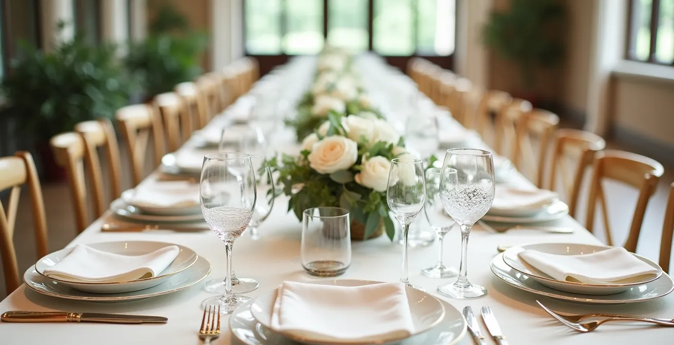
The most fundamental element of dining comfort is personal space. Before a single plate is placed, the ergonomic success of your tablescape is determined by the “comfort radius” allocated to each guest. Overlooking this foundational measurement is the fastest way to undermine a luxurious atmosphere. When guests are forced to tuck in their elbows, twist to avoid their neighbors, or struggle to get in and out of their seats, the experience feels cramped and stressful, regardless of the decor’s quality.
The industry standard for formal dining is not a suggestion; it’s a functional necessity. Professional event planners, like Milestone Events Group, consistently recommend providing 24 inches (or 2 feet) of space per guest at a rectangular table. This measurement isn’t arbitrary. It accounts for the width of the chair, the space for a full place setting, and most importantly, the “elbow room” required for comfortable eating. According to industry guidelines that confirm the 24-inch standard, this space should be measured from the center point of one seat to the center point of the next.
Trying to squeeze in an extra person per table might seem efficient, but it has the opposite effect on the perceived value of the event. A generous allocation of space is a non-verbal cue of hospitality and luxury. It signals that guest comfort was a top priority. A crowded table, on the other hand, communicates a lack of foresight and detracts from the formality and elegance you’ve worked so hard to create. This principle is the bedrock of good dining ergonomics.
The 14-inch rule: keeping centerpieces below or above eye level
Once individual space is secured, the next ergonomic challenge is the shared space in the center of the table. Centerpieces are crucial for setting the aesthetic tone, but they are also the primary culprits in disrupting social interaction. A beautiful arrangement that blocks eye contact effectively builds a wall between guests, stifling conversation and creating a disconnected, isolating experience. The goal is to achieve visual impact without sacrificing what we can call sightline integrity.
The solution is the simple but powerful “14-inch rule.” The average person’s eye level when seated is between 14 and 16 inches from the tabletop. To maintain clear sightlines, your centerpieces must be designed to stay entirely out of this critical zone. This leaves you with two clear strategic options: go low or go high. As wedding designer Hannah Baskett notes, “Tall centerpieces can add drama and height, while low arrangements promote conversation among guests. Ensure that centerpieces don’t obstruct the view or conversation between your guests.”
This principle forces a deliberate design choice that enhances, rather than hinders, the guest experience. A low arrangement, under 12-14 inches, creates an intimate, shared garden across the table. A tall arrangement, with the bulk of its mass starting well above 24 inches, provides drama and draws the eye upward without creating a visual barrier. The space in between is a dead zone for conversation.
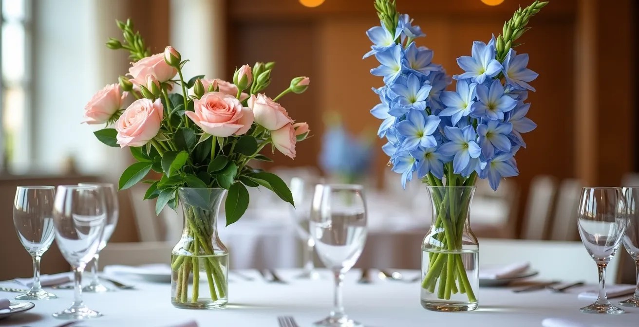
As the illustration demonstrates, either a low or a very tall arrangement preserves the crucial connection between guests. Choosing an arrangement that falls within the 14-to-24-inch range is the most common mistake in tablescape design, and one that is easily avoided with this simple ergonomic rule. The choice between high and low becomes a strategic tool to shape the social atmosphere of your event.
Charger, dinner, salad: ensuring the stack doesn’t wobble when cut?
Layered place settings are a hallmark of formal dining, adding depth and color to the tablescape. However, this aesthetic can quickly turn into a functional nightmare if the stack is unstable. Nothing shatters the illusion of elegance faster than a guest’s dinner plate sliding around on their charger, or the entire stack wobbling precariously as they try to cut their food. The key to a successful layered look is engineering for stack stability.
The foundation of a stable stack is the charger plate. A standard formal dinner charger measures 12-13 inches, providing a wide and solid base. Choosing a charger with some heft or a non-slip bottom can dramatically improve stability. The plates stacked on top must also be chosen with physics in mind. Plates with a wide, flat rim create a more stable connection than those with a deep, curved bowl that can rock on the plate below it. Some plates are even designed with an unglazed bottom rim, creating friction that prevents sliding.
To ensure your beautiful layered setting is also a joy to use, consider these stability-enhancing combinations. A heavier charger acts as an anchor, while plates with compatible rim shapes nestle into each other securely.
| Plate Type | Stability Feature | Best Use |
|---|---|---|
| Wide-rimmed plates | Rim acts as cradle for plate above | Multi-course formal dinners |
| Textured bottom plates | Unglazed rim prevents sliding | Stacked presentations |
| Weighted chargers | Heavy base prevents movement | Foundation for lighter plates |
Before finalizing your rental order, it’s wise to test the stack. Place the charger, dinner plate, and salad plate together and apply gentle pressure with a knife. If there’s significant wobble or sliding, consider swapping one of the components for a more stable option. This small ergonomic check ensures your guests can dine with confidence and ease.
Under the plate vs. On top: which encourages guests to settle in faster?
The placement of the napkin is a subtle but surprisingly impactful detail in dining ergonomics. While often viewed as a purely decorative choice—a vehicle for an elaborate fold or a pop of color—its position sends a clear psychological signal to guests as they approach the table. The decision of placing the napkin on the plate versus beside it directly influences how quickly and comfortably a guest feels they can “move in” to their space.
Placing a beautifully folded napkin on top of the plate stack creates a “display first, function second” impression. It acts as a temporary barrier, however slight, that the guest must first admire and then dismantle before they can truly settle. It signals that the setting is a presentation to be looked at. In contrast, placing a simply folded napkin to the left of the forks creates an immediate sense of welcome. The space is open and ready for the guest, signaling that the primary purpose of the setting is to dine.
This isn’t to say on-plate napkins are wrong; they add a layer of formality. However, from a pure ergonomic standpoint of encouraging guests to feel at ease, the side placement is superior. As noted by Marissa Renee Events, a complex fold can add a fun dimension, but when in doubt, “go with a flat fold” placed to the side. This approach minimizes fuss and maximizes welcome. Consider these psychological effects when deciding on placement:
- Side placement (left of forks): Creates an immediate welcome and signals “ready to dine.” Encourages guests to settle in faster.
- On-plate placement: Adds formality but creates a small barrier to immediate seating. Signals “display first, function second.”
- Simple folds: Are more approachable and less intimidating for guests to unfold and use.
- Elaborate folds: Can be impressive but may cause guests to hesitate, unsure if they should disturb the “art.”
For an experience centered on guest comfort, a simple, elegant fold placed beside the plate setting is the most effective choice. It respects the design while prioritizing the guest’s seamless transition from arriving at the table to being ready for the meal.
Water, Red, White, Champagne: fitting 4 glasses without a breakage risk
A multi-course meal often comes with a corresponding flight of wines, leading to a common ergonomic problem: the glassware collision zone. Arranging up to four glasses—water, red wine, white wine, and a champagne flute—for each guest can quickly create a crowded and precarious situation. A poorly arranged cluster of stemware increases the risk of spills and breakage, and makes it difficult for guests to confidently reach for the correct glass. The solution lies in strategic, space-efficient arrangement.
The most stable and intuitive layout for multiple glasses is the diamond or triangle formation. The water goblet, which is typically the largest and most frequently used glass, should be placed directly above the tip of the dinner knife. The other glasses are then arranged to the right and slightly behind it. For four glasses, a diamond shape is effective: water goblet in front, red and white wine glasses to the left and right behind it, and the tall, slender champagne flute at the very back. This staggers the glasses, making each one accessible without having to reach over another.
To further enhance the design without adding clutter, consider using a single colored glass. As one expert suggests, “A coloured water glass is a simple substitution which really lifts a tablescape.” This adds a pop of personality and helps visually differentiate the water glass from the wine glasses, a subtle but helpful ergonomic cue.
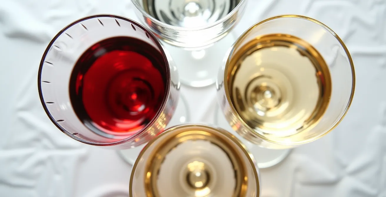
The key is to use vertical space and diagonal lines to your advantage, as seen in the diamond formation. This avoids a straight, crowded line of glasses that are easy to knock over. By planning the glassware layout with the same precision as the rest of the setting, you ensure guests can enjoy their beverages without fear of causing a domino effect of spills.
10 chairs at a 60-inch round: is it too tight for a formal dinner?
One of the most pervasive myths in event planning is the capacity of a 60-inch (5-foot) round table. Many venues and rental companies will state it can seat 8-10 guests. While technically true for a casual, buffet-style event with minimal place settings, applying this number to a formal, multi-course wedding dinner is a critical ergonomic error. For a meal involving charger plates, multiple glasses, and cutlery for several courses, attempting to seat 10 guests at a 60-inch round is not just tight—it’s functionally impossible.
The math is straightforward. A 60-inch round table has a circumference of approximately 188.5 inches. Divided among 10 guests, this leaves a mere 18.85 inches of space per person. This is drastically below the 24-inch “comfort radius” required for a formal place setting and comfortable dining. At under 19 inches, guests’ charger plates will be overlapping, and they will be unable to use their knife and fork without bumping elbows. For this reason, wedding planning experts recommend seating only 6-8 guests at a 60-inch round for any formal event.
This distinction between casual and formal capacity is vital for ensuring guest comfort. Forcing the maximum number of chairs around a table creates a ripple effect of ergonomic problems, from clutter to spills, completely undermining the sophisticated atmosphere you aim to create.
| Table Size | Casual Dining | Formal Dining | Circumference |
|---|---|---|---|
| 60-inch round | 8-10 guests | 6-8 guests | 188.5 inches |
| 72-inch round | 10-12 guests | 8-10 guests | 226.2 inches |
Always clarify with your planner or venue that you are planning for formal dining capacity. Opting to seat 8 guests comfortably at a 60-inch table, or upgrading to a 72-inch round for 10 guests, is an investment in the quality of your guests’ experience. It demonstrates a commitment to comfort over simply maximizing headcount.
Tall vs. Low: stopping your arrangements from blocking guest eye contact
We’ve established the “14-inch rule” to maintain sightline integrity, but ergonomic centerpiece design goes beyond just height. The *volume* and *density* of an arrangement are equally important. A tall centerpiece can still allow for conversation if it possesses what we might call visual porosity—a quality of being airy and see-through. A solid, dense arrangement, even if tall, acts as a visual wall. The goal is to create impact and drama without creating a solid barrier.
As noted by Rachael Ellen Events, the impact of florals is a combination of “Texture, color, shape, and quantity.” This is especially true for tall arrangements. Instead of a tight, dense ball of flowers on a tall stand, opt for arrangements that use delicate, airy branches, slender stems like delphinium, or orchids. This allows guests to see *through* the arrangement, maintaining a sense of connection with those across the table. The arrangement adds to the ambiance without dominating the social dynamic.
Alternatively, you can place denser, more substantial arrangements at the ends of long rectangular tables, where they won’t block anyone’s view, and use lower arrangements in the center. This creates a beautiful “tablescape” down the length of the table while prioritizing conversation where people are seated most closely. The key is to constantly test the design from a seated guest’s perspective.
Your Checklist for Visually Porous Centerpieces
- Assess materials: Do your arrangements use airy branches and delicate stems (like cherry blossoms or pampas grass) for tall designs to maintain a see-through quality?
- Check density: Is the densest part of the arrangement below the 14-inch eye-level or well above it, not within it?
- Review placement: Are the most solid and substantial floral pieces positioned at the ends of the table, rather than in the direct center of guest sightlines?
- Test sightlines: Have you physically sat in various chairs at a mock-up table to ensure you can comfortably see the person across from you?
- Consider removable elements: For very dramatic tall centerpieces, could the top portion be removed after the grand entrance to facilitate conversation during dinner?
By thinking about your centerpieces not as solid objects but as compositions of form and empty space, you can achieve a design that is both dramatic and deeply considerate of your guests’ need to connect with one another. Visual porosity is the final layer of sophistication in ergonomic floral design.
Key Takeaways
- Prioritize Space: The foundation of luxury is comfort. Ensure a minimum of 24 inches per guest for formal dining.
- Respect Sightlines: Keep centerpieces strictly below 14 inches or well above 24 inches to encourage guest conversation.
- Engineer for Stability: A beautiful tablescape is useless if it’s not functional. Test your plate stacks for wobbling and choose glassware arrangements that prevent spills.
How to Select Gold Cutlery That Looks Expensive and Feels Heavy?
The final element that guests physically interact with is the cutlery. It’s the tool they hold for the majority of the meal, and its quality can leave a lasting impression. When selecting gold cutlery, the goal is to find a set that not only looks luxurious but also feels substantial and durable in the hand. The secret to achieving this expensive look and feel lies not in the color itself, but in the material science of the metal and its finish.
The most important factor is the base material. For high-quality, heavy-feeling cutlery, look for 18/10 stainless steel. The “18/10” refers to the composition: 18% chromium for rust resistance and 10% nickel for a brilliant shine and added weight. According to industry experts, professional-grade cutlery features this composition because it offers superior corrosion resistance and durability. This higher nickel content gives the cutlery a satisfying heft that is immediately associated with quality, unlike cheaper, lighter alternatives.
The second factor is the gold finish itself. Traditional gold plating is often a thin layer that is prone to scratching, flaking, and fading, especially after a few washes. For a finish that is both beautiful and resilient enough for hospitality use, look for cutlery with a PVD coating. PVD (Physical Vapor Deposition) is a modern process that bonds a thin layer of titanium to the stainless steel, which is then colored. As detailed in an analysis of the technology, PVD coatings are highly resistant to chipping and fading, ensuring the cutlery looks pristine throughout the event and beyond. This technology provides the consistent, rich appearance of gold with the durability of industrial-grade steel.
| Finish Type | Durability | Appearance | Maintenance |
|---|---|---|---|
| PVD Titanium Gold | Heavy duty, developed for hotels and restaurants | Consistent metallic sheen | Dishwasher safe, 3000+ washes |
| Traditional Gold Plating | Prone to flaking and wear | Can look cheap if too yellow | Hand wash recommended |
When sourcing your cutlery, specifically ask your rental company if their gold flatware is 18/10 stainless steel with a PVD finish. This combination is the benchmark for quality and ensures the final touch on your table feels as luxurious as it looks.
Ultimately, a truly luxurious tablescape is one that anticipates and serves the needs of your guests. By applying these ergonomic principles, you move beyond mere decoration to become a thoughtful architect of your guests’ comfort. This approach is the final word in sophisticated event design.