The secret to luxurious gold cutlery isn’t the color, but the tangible weight and the science behind its finish.
- Heavier cutlery, especially a dinner fork over 80 grams, is scientifically perceived as higher quality and can increase guests’ willingness to pay for a meal.
- Physical Vapor Deposition (PVD) is a durable, scratch-resistant coating, whereas cheaper electroplating and spray paint will quickly degrade.
Recommendation: Always ask your vendor for the exact gram weight per piece and the steel grade (18/10 is superior) before renting or buying.
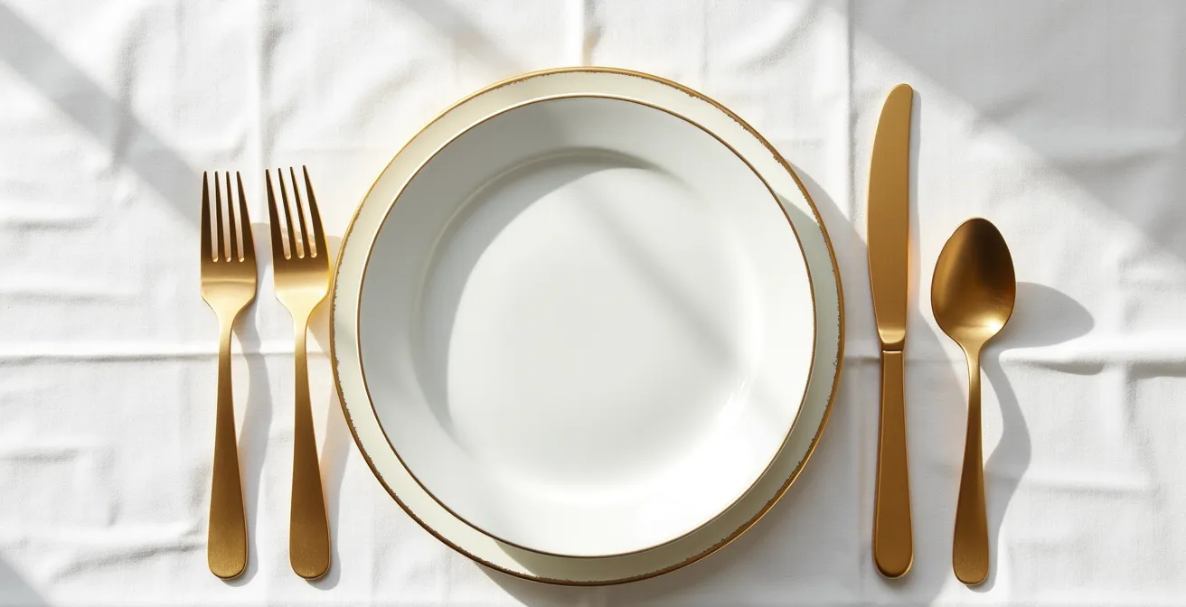
The allure of a tablescape gleaming with gold cutlery is undeniable. It promises luxury, warmth, and a touch of modern glamour perfect for a wedding. But beneath this golden shimmer lies a common fear for couples: choosing flatware that looks stunning in photos but feels flimsy, cheap, and disappointing in a guest’s hand. The market is flooded with options, and the difference between a treasured detail and a tacky mistake is often invisible to the untrained eye.
Most advice focuses on aesthetics—matching your theme or your plates. While important, this overlooks the fundamental truth of luxury goods. The real mark of quality isn’t something you just see; it’s something you feel. It’s the substantial heft in your palm, the resilience of the finish against a stray scratch, and the subtle sound it makes against porcelain. It’s a matter of material integrity, not just color.
This guide moves beyond simple styling tips. We will deconstruct the physical properties that separate high-end gold cutlery from its inferior counterparts. We will delve into the science of weight perception, the chemistry of durable coatings, and the subtle design cues that signal true craftsmanship. By the end, you won’t just be choosing cutlery; you’ll be curating an experience, armed with the expert knowledge to ensure your investment feels as good as it looks.
This comprehensive guide will walk you through the critical factors, from tangible weight to metallic undertones, ensuring you can confidently select the perfect gold flatware for your event. The following sections detail everything you need to know to make an informed and sophisticated choice.
Summary: The Definitive Guide to Selecting Premium Gold Flatware
- Why light cutlery feels cheap and how to check the gram weight?
- Rose gold vs. Brass gold: avoiding a metal clash on the table
- The scratching risk: why caterers hate washing gold cutlery and charge extra?
- Fingerprints: why matte gold hides smudges better during dinner?
- Modern minimal vs. Ornate: which gold shape suits your plates?
- The psychology of metallics: choosing the right finish for perceived value
- Can you mix brass candelabras with silver cutlery without it looking messy?
- How to Choose Crystal Glassware That Enhances the Wine and the Table?
Why light cutlery feels cheap and how to check the gram weight?
The first and most powerful indicator of quality is weight. Our brains are hardwired to associate weight with substance, value, and quality. When a guest picks up a fork that feels feather-light, it instantly sends a subconscious signal of cheapness, regardless of how beautiful it looks. This isn’t just a feeling; it’s a proven psychological phenomenon. The Sheraton Grand Edinburgh conducted a fascinating real-world experiment where diners were served identical meals with different cutlery. Those using heavier, banquet-style flatware not only rated the food as more artistic but also showed approximately 15% higher willingness to pay for the meal. This demonstrates how physical heft directly translates into perceived value.
For couples aiming for a luxurious experience, understanding cutlery weight is non-negotiable. Flatware is typically categorized as medium, heavy, or extra-heavy weight. For a premium feel, you should aim for extra-heavy weight. The key is to get specific with your rental company or supplier. Don’t be afraid to ask for the numbers. A high-quality dinner fork should weigh over 80 grams. Standard event cutlery often falls in the 50-70 gram range, while anything under 40 grams will feel decidedly flimsy and cheap.
Another crucial factor contributing to weight and quality is the steel grade. Cutlery is made from stainless steel, which is then coated. Ask for 18/10 stainless steel. The “10” refers to the 10% nickel content, which provides superior weight, a warmer feel, and better resistance to corrosion compared to the cheaper and lighter 18/0 grade. A well-balanced piece will also have its center of gravity in the palm, not at the tips, making it feel like a natural extension of the hand.
Your Action Plan: Vendor Weight Inquiry Checklist
- Ask for the exact gram weight per piece: Aim for a dinner fork above 80g for a premium feel.
- Request the steel grade specification: Insist on 18/10 stainless steel for its superior heft and quality.
- Inquire about the flatware weight category: Specify that you are interested in “extra heavy weight” options.
- Test the balance point: If possible, hold a sample to ensure the center of gravity rests comfortably in your palm.
- Listen to the sound: Heavier, quality cutlery produces a deep, resonant ‘clink’, while lightweight pieces have a tinny ‘tinkle’.
Rose gold vs. Brass gold: avoiding a metal clash on the table
Once you’ve established a standard for weight, the next consideration is color. Not all “gold” is created equal. The two most popular tones in wedding decor are traditional brass gold and the trendier rose gold, each carrying a distinct personality and interacting with light and other colors differently. Choosing the right tone is essential for achieving chromatic cohesion on your tablescape. A traditional brass gold has warm, yellow-orange undertones that are beautifully enhanced by the soft, flickering glow of candlelight, creating a rich and classic atmosphere. It pairs naturally with warm-toned linens, amber lighting, and ivory florals.
In contrast, rose gold possesses cooler pink or even bluish undertones. This finish is particularly flattering in natural daylight, where its unique hue can be fully appreciated. It works wonderfully with blush tones, soft grays, and can even be mixed with silver accents for a contemporary look. A third, more neutral option is champagne gold, which has a beige undertone, making it a versatile bridge between warm and cool metal palettes.
Understanding these undertones is the key to creating a look that feels intentional and curated, rather than accidental and mismatched. The wrong gold tone can clash with your charger plates or glassware, creating a subtle but jarring visual dissonance. A simple side-by-side comparison can reveal these nuances and guide your selection.
This comparative table breaks down the characteristics of each gold tone to help you decide which best suits your wedding’s lighting and overall color scheme.
| Gold Type | Undertone | Best Lighting | Pairing Strategy |
|---|---|---|---|
| Brass Gold | Warm yellow/orange | Candlelight enhances richness | Pair with warm linens, amber lighting |
| Rose Gold | Cool pink/blue | Natural daylight flattering | Mix with blush tones, silver accents |
| Champagne Gold | Neutral beige | Versatile in all lighting | Bridge between warm and cool metals |
The scratching risk: why caterers hate washing gold cutlery and charge extra?
The single greatest point of failure for gold cutlery is durability, specifically its resistance to scratching and peeling. This is where a deep understanding of material integrity separates the expert from the novice. The beautiful gold color is a coating, and the method of application determines its longevity. The cheapest options are little more than spray paint, which can flake off after a single use. A step up is electroplating, a common method that can produce a lovely finish but is highly susceptible to scratching from abrasion in washing or even from acidic foods.
The gold standard—both literally and figuratively—is Physical Vapor Deposition (PVD). This is an advanced vacuum coating process where the gold-colored material (often titanium nitride) is molecularly bonded to the stainless steel underneath. The result is a finish that is not only beautiful but also incredibly hard, scratch-resistant, and chemically inert. It will not tarnish, fade, or react with food. While more expensive upfront, PVD is the only finish a true tableware expert would recommend for an item that will see repeated use and washing. When you see gold cutlery that has maintained its luster after years of service, it is almost certainly PVD coated.
This durability issue is well-known in the event industry. As a case study, Event Decor Hire in London, which manages over 1,000 sets, notes that gold cutlery requires special handling. They must enforce hand-washing protocols, use separate storage to prevent scratching, and factor in higher replacement costs for damaged pieces. These extra labor and risk costs are why many caterers and rental companies charge a premium for gold flatware. It’s not just for the look; it’s an insurance policy against the fragility of inferior coatings.
This image provides a clear visual of the robust surface quality you should be looking for.
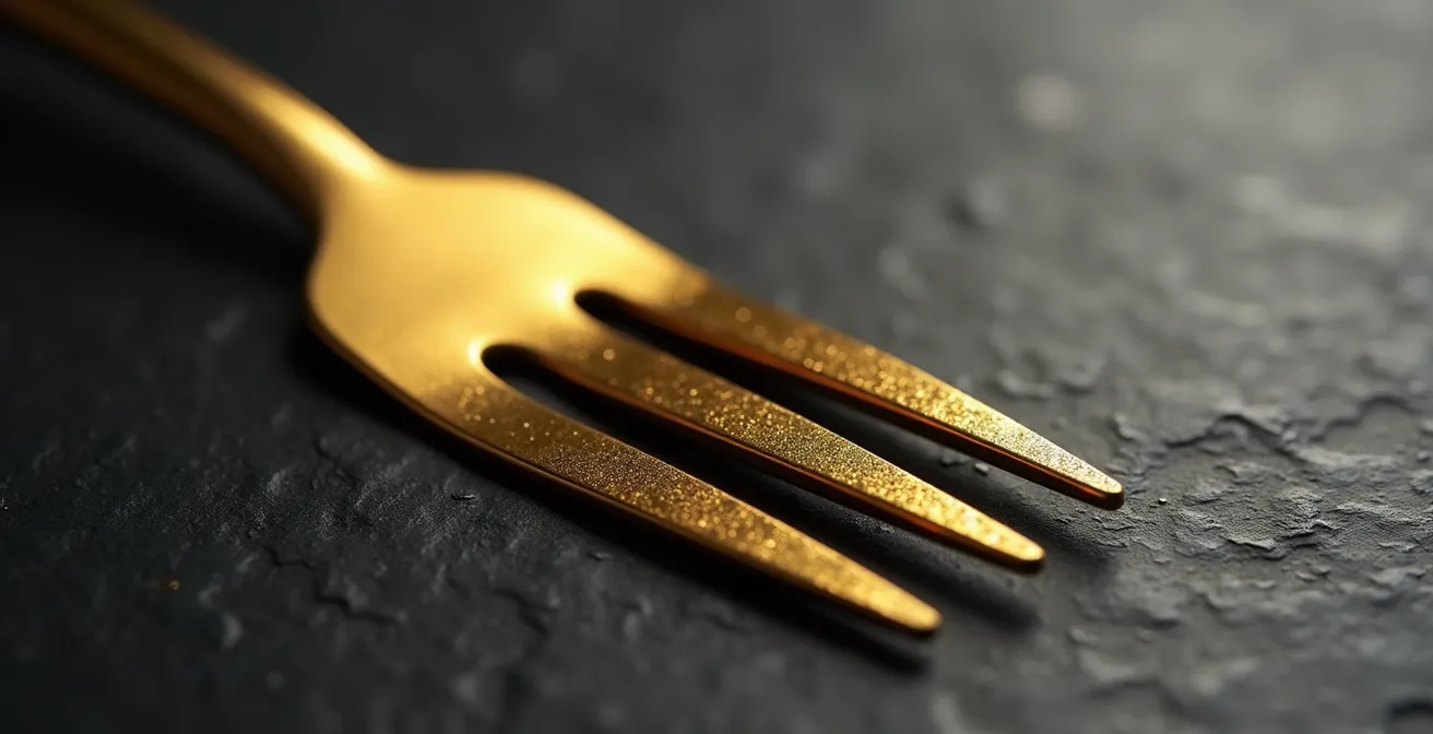
As the macro detail shows, a flawless PVD coating is uniform and dense, providing a formidable barrier against the rigors of a dinner service. When inquiring with a vendor, specifically asking if their cutlery is PVD coated is a powerful way to signal you know what you’re looking for and to filter out lower-quality options immediately.
Fingerprints: why matte gold hides smudges better during dinner?
Beyond durability, the finish of your gold cutlery has a major impact on its appearance throughout your event. The choice is primarily between a high-shine, mirrored finish and a contemporary matte or brushed finish. While shiny gold has a traditional, glamorous appeal, it has a significant practical drawback: it is a magnet for fingerprints and smudges. Every touch during setup and service will be visible, requiring constant polishing by staff to maintain a pristine look.
This is where matte gold offers a superior functional advantage. The non-reflective surface, whether achieved through brushing or sandblasting, creates microscopic textures that diffuse light. These micro-shadows are incredibly effective at camouflaging the natural oils from fingerprints, meaning the cutlery will look cleaner and more elegant for longer, even after being handled by guests. This practical benefit is a key reason for the rising popularity of matte finishes in high-end restaurant and event design. It maintains the desired aesthetic with far less maintenance.
There is also an artistic consideration, particularly for your wedding photos. The intense reflection from shiny cutlery can be challenging for photographers, often creating harsh “hotspots” or flash blowouts in detail shots of your place settings. As one professional wedding photographer noted in a feature for Inside Weddings Magazine, “Matte finishes are preferred by wedding photographers because they don’t create harsh reflections or flash blowouts, resulting in more beautiful, professional-looking detail shots.” A matte finish absorbs light more gently, allowing the shape and color of the cutlery to be captured beautifully, preserving the memory of your carefully designed tablescape.
Therefore, while a mirrored finish can be tempting for its immediate “wow” factor, a brushed or matte gold finish is often the more sophisticated and practical choice for an event, delivering both aesthetic longevity and superior photographic results.
Modern minimal vs. Ornate: which gold shape suits your plates?
The final layer of your decision-making process is style and shape. Gold cutlery is available in a spectrum of designs, from ultra-sleek, minimalist forms to heavily ornate, baroque patterns. The right choice is not about which is “better,” but which is a better partner for your existing table elements, particularly your plates. The golden rule is one of balance: if your plates are ornate, choose simple cutlery; if your plates are simple, you can choose ornate cutlery. A heavily patterned plate paired with an intricate fork creates a busy, cluttered look. Conversely, a minimalist plate can serve as the perfect canvas to showcase a beautifully detailed cutlery design.
There is also a hidden quality indicator in this choice. A cutlery manufacturing expert from XR Cutlery’s industry blog offers a fascinating insight: “Intricate patterns on cheaper cutlery can sometimes be used to hide minor manufacturing imperfections, whereas a minimalist design demands a flawless finish.” This is a crucial point. A clean, unadorned, minimalist piece of cutlery has nowhere to hide. Every inch of its surface must be perfectly polished and free of defects. Choosing a minimalist design from a reputable supplier is often a statement of confidence in the quality of the material and craftsmanship.
This visual comparison demonstrates the stark contrast between the two dominant styles.
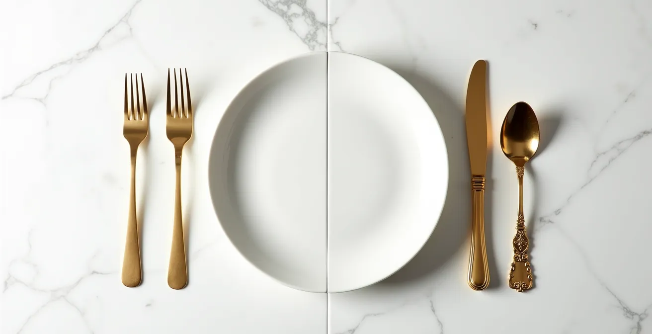
On one side, you have the clean lines and razor-thin handles of modern design, which speak of elegance and restraint. This style pairs beautifully with rustic stoneware or simple, rimless porcelain plates. On the other, the elaborate scrollwork of baroque-style cutlery offers a sense of history and opulence, making a bold statement alongside simple white plates with a classic silver or gold rim. Consider the overall story your table is telling. Is it one of modern romance, rustic charm, or timeless grandeur? The shape of your cutlery is a key character in that story.
The psychology of metallics: choosing the right finish for perceived value
The choice of metallic finish on your table does more than just contribute to a color scheme; it actively influences your guests’ perception of the entire dining experience. This is the realm of sensory economics, where tangible cues like weight, finish, and even sound shape perceived value. We’ve already seen how heavy cutlery can make food seem more valuable, but the auditory feedback is also part of this equation. Research shows the solid ‘clink’ of heavy, high-quality cutlery against a plate is more satisfying to the ear than the tinny sound of cheaper alternatives. In fact, some studies suggest this positive auditory cue can increase a diner’s meal enjoyment by approximately 10%.
The color itself also carries powerful psychological weight. Gold has always been associated with wealth, success, and celebration. Its warm glow creates an inviting and luxurious atmosphere. However, different shades can be used to evoke different feelings and even encourage specific behaviors. A fascinating case study in modern sensory marketing is the “Rose Gold Instagram Effect.” XR Cutlery, a major supplier, reports that restaurants specifically choose rose gold flatware to create an ‘Instagrammable’ dining experience. The warm pinkish-gold finish photographs exceptionally well under ambient restaurant lighting, and these establishments see a direct correlation between the use of this specific metallic and an increase in social media posts from patrons, which in turn drives more reservations. This shows that the metallic choice was not merely decorative but a strategic business decision aimed at generating user content.
For your wedding, this means thinking about the finish as a tool. Do you want the classic, unimpeachable luxury of a traditional warm gold? Or do you want the modern, photo-friendly appeal of rose gold? Does a matte finish align with an understated, sophisticated vibe, while a shiny finish aims for maximum glamour and sparkle? Each choice sends a message and helps to craft the overall sensory narrative of your event.
Can you mix brass candelabras with silver cutlery without it looking messy?
Mixing metals on a tablescape is a modern and sophisticated design choice, but it can feel intimidating. The fear is creating a look that appears messy or accidental rather than intentional and curated. The key to success, as an interior design expert on the INOX Flatware blog notes, is that “Mixing metals from two different color families adds visual interest and depth, while combining similar metals looks sloppy and inconsistent.” This means a deliberate mix of a warm metal (like gold or brass) with a cool metal (like silver or chrome) is the way to go.
To execute this successfully, designers follow a few core principles. The most important is the 80/20 rule. One metal should be dominant, making up about 80% of the metallic elements on the table, while the second metal serves as a 20% accent. For example, if you have gold-rimmed charger plates and gold cutlery (your 80% dominant metal), you could add silver candelabras as your 20% accent. This creates a clear hierarchy and prevents the two metals from competing for attention.
Another advanced technique is to match the finish, not just the color. Brushed brass will pair more harmoniously with brushed silver than it will with polished silver, because the consistent texture creates a visual link between the different colors. Finally, you can use a “bridge” element—an item that incorporates both metals. A menu card with both gold and silver foil, or glassware with a subtle gold rim and a silver stem, can tie the entire look together seamlessly.
Here are some core guidelines for achieving mixed-metal harmony:
- Apply the 80/20 Rule: Let one metal dominate (80%) and use the other as a deliberate accent (20%).
- Create a Bridge Element: Use items like charger plates, glassware, or stationery that feature both metal tones to unify the scheme.
- Match Finishes, Not Colors: A brushed gold pairs better with a brushed silver than a polished one. Consistency in texture creates cohesion.
- Group by Temperature: Intentionally pair warm metals (gold, brass, copper) with cool metals (silver, chrome, platinum).
- Be Consistent: Ensure all pieces of the same metal have a consistent tone and texture to look curated, not chaotic.
Key takeaways
- Weight is a non-negotiable indicator of quality. A dinner fork should be over 80 grams and made of 18/10 stainless steel for a premium feel.
- The coating method is crucial for durability. Insist on Physical Vapor Deposition (PVD) to prevent scratching and peeling; avoid cheaper electroplating and spray paint.
- Matte and brushed finishes are more practical than high-shine options as they hide fingerprints and photograph better, maintaining an elegant look throughout your event.
How to Choose Crystal Glassware That Enhances the Wine and the Table?
Your choice of glassware is not an isolated decision; it is in direct conversation with your cutlery. Just as the weight of a fork signals quality, the substance and style of your crystal glassware contribute to the overall perception of luxury. The goal is to achieve visual weight consistency. As a case study from high-end hotels reveals, pairing substantial, heavy-based crystal with equally substantial gold cutlery creates a powerful alignment of perceived value. Conversely, if you’ve chosen delicate, thin-handled gold flatware, it should be paired with light, thin-stemmed glassware to maintain a sense of proportional harmony. A mismatch in visual weight—like heavy, clunky glasses with delicate cutlery—can feel just as jarring as clashing colors.
The finish of your gold cutlery should also influence your crystal selection. The interaction with light is key. A shiny, mirrored gold finish will be amplified by faceted or cut crystal, creating a dazzling effect of scattered sparkle for maximum glamour. A modern, matte gold finish, however, pairs more elegantly with smooth, uncut crystal. The clean, uninterrupted reflections between the two create a look of understated, contemporary luxury.
If you have gold-rimmed glassware, you create an instant point of cohesion, allowing you to use almost any tone of gold cutlery with confidence. The key is to ensure the gold of the rim and the gold of the flatware are not drastically different. A warm brass gold cutlery set will look stunning with a warm brass gold-rimmed glass, creating a unified and opulent feel. The following guide provides a quick reference for pairing these two essential table elements.
| Crystal Style | Gold Cutlery Match | Light Interaction | Visual Effect |
|---|---|---|---|
| Faceted/Cut Crystal | Shiny gold finish | Scattered sparkle | Maximum glamour |
| Smooth Modern | Matte gold | Clean reflections | Understated elegance |
| Gold-Rimmed | Any gold tone | Unified metallic | Cohesive luxury |
| Colored Crystal | Consider color cast | Tinted reflections | Dramatic atmosphere |
Armed with this knowledge, you are now ready to choose your gold cutlery not as a hopeful romantic, but as a confident expert. Begin by evaluating the weight, finish, and material of your top choices to ensure your wedding tablescape is every bit as luxurious in person as it is in your dreams.