The biggest fear when planning a vintage wedding is creating a theme party instead of a timeless event.
- True elegance comes from curation, not accumulation of old objects.
- Focus on high-impact ‘heirloom moments’ instead of total historical accuracy.
- Prioritize modern guest comfort above all else to ensure a sophisticated experience.
Recommendation: Apply the 80/20 rule—dedicate 80% of your design to modern function and comfort, and 20% to curated vintage aesthetics for maximum impact without sacrificing elegance.
You’ve fallen in love with the romance of a bygone era—the glamour of the 1920s, the intricate details of the Victorian age. Yet, a nagging fear creeps in: how do you capture that spirit for your wedding day without it tipping over into a theatrical, costume-party cliché? Many couples find themselves trapped between their aesthetic dreams and the risk of creating an event that feels dated or, worse, uncomfortable for their guests. The common advice is to simply “mix old with new,” but this vague suggestion often leads to a disjointed collection of vintage props, from stacks of old suitcases to randomly placed typewriters, that feel more like a stage set than a personal celebration.
The secret to a truly sophisticated vintage-inspired wedding isn’t about recreating a specific year with historical precision. It’s about transcending imitation and moving into the realm of interpretation. The key is shifting your mindset from accumulation to curation. Instead of asking, “How many vintage things can I add?” ask, “Which specific elements will tell our story and create a powerful emotional impact?” This approach focuses on creating a few stunning “heirloom moments” that stand out against a backdrop of modern elegance and comfort.
This guide provides a strategic framework to help you achieve that perfect balance. We will deconstruct the elements of vintage styling—from furniture and materials to stationery and tableware—to show you how to make deliberate, impactful choices. You will learn not just what to do, but why certain combinations work, empowering you to create an event that feels both deeply personal and effortlessly timeless.
In this article, we will explore the practical strategies for integrating vintage charm with contemporary sensibilities. Follow this guide to craft a celebration that honors the past while feeling entirely present.
In This Article: Your Guide to a Timeless Vintage Celebration
- How to use antique furniture without sacrificing guest comfort?
- Gold foil vs. Brass accents: choosing the right materials for a 1920s vibe
- Thrifting vs. Renting: where to find 150 vintage goblets efficiently?
- Why forcing guests into strict period dress codes often backfires?
- Font choices: how to hint at a classic era on invites without looking dated?
- Grandmother’s china vs. Rental charger plates: mixing old and new
- How to mix cut crystal with sleek modern stems for a curated look?
- How to Use Rattan Furniture for a Modern Look That Isn’t Dated?
How to use antique furniture without sacrificing guest comfort?
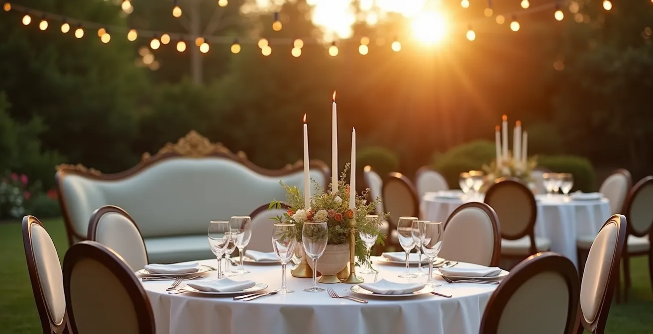
The vision of a stunning, antique velvet settee or ornate Louis XVI chairs is captivating, but the reality of seating 100 guests on them for several hours is a logistical and physical nightmare. The number one rule of sophisticated event design is that guest experience trumps aesthetics. An uncomfortable guest will remember their aching back long after they’ve forgotten the beautiful decor. In fact, guest comfort is a top priority, with recent wedding data showing that over 58% of couples place it at the forefront of their planning.
The solution is not to abandon antique furniture, but to use it strategically. Adopt the 80/20 rule of atmosphere: ensure 80% of your functional elements (like guest seating and dining tables) are modern, ergonomic, and comfortable. Dedicate the remaining 20% to high-impact, decorative vintage pieces that define the space without compromising function. This means renting modern, comfortable chairs for the majority of your guests and reserving the stunning antique pieces for photographic moments or limited, specific roles.
Use an exquisite antique bench for the guest book signing station, a vintage loveseat for the couple’s sweetheart table, or create a dedicated photo booth area with a collection of ornate chairs. These become “zones” of vintage charm that guests can interact with on their own terms. Another elegant solution is to create a “comfort lounge”—a separate, stylish area furnished with modern, plush sofas and armchairs, but accented with vintage side tables or lamps. This gives guests a comfortable place to relax while still being immersed in your curated aesthetic.
Action Plan: Implementing the 80/20 Comfort Strategy
- Prioritize Seating: Use unique vintage chairs for only 20% of seating, such as the head table or the couple’s chairs, where visual impact is highest.
- Rent for the Majority: Rent modern, ergonomic chairs for the remaining 80% of guest seating to ensure comfort throughout the ceremony and reception.
- Create Photo Zones: Position purely decorative antique furniture, like a fragile settee, in dedicated photo zones where they won’t be used for long-term seating.
- Design Comfort Lounges: Set up designated lounge areas with comfortable, modern upholstered seating, using vintage pieces as accents (e.g., coffee tables, side tables).
- Use for Display Only: Repurpose beautiful but non-functional vintage furniture for static displays, such as a dessert table, gift station, or escort card display.
By treating antique furniture as powerful accent pieces rather than functional workhorses, you achieve the best of both worlds: a stunning vintage look and happy, comfortable guests.
Gold foil vs. Brass accents: choosing the right materials for a 1920s vibe
When evoking the glamour of the Art Deco period, metallic accents are non-negotiable. But the choice between different types of gold can dramatically alter the feel of your event. The two main contenders, gold foil and brass, serve very different purposes and create distinct moods. Gold foil, with its crisp, clean, and highly reflective surface, speaks to modern luxury. Brass, especially when it has a natural patina, brings a sense of history, weight, and authenticity. Choosing the right one depends entirely on the object it’s applied to and the story you want to tell.
Gold foil is best reserved for flat, paper-based goods. Its precision makes it perfect for adding a touch of luxe to invitations, menus, place cards, and signage. The sharp lines and brilliant shine feel intentional and high-end. Conversely, brass is a three-dimensional material. It excels in objects that have form and function: candlesticks, photo frames, vases, or charger plates. An aged brass candlestick has a grounding presence and textural depth that foil can never replicate. Trying to use foil on a 3D object can look cheap, while using a brass-like color in printing often looks muddy and unconvincing. The key is to let each material do what it does best.
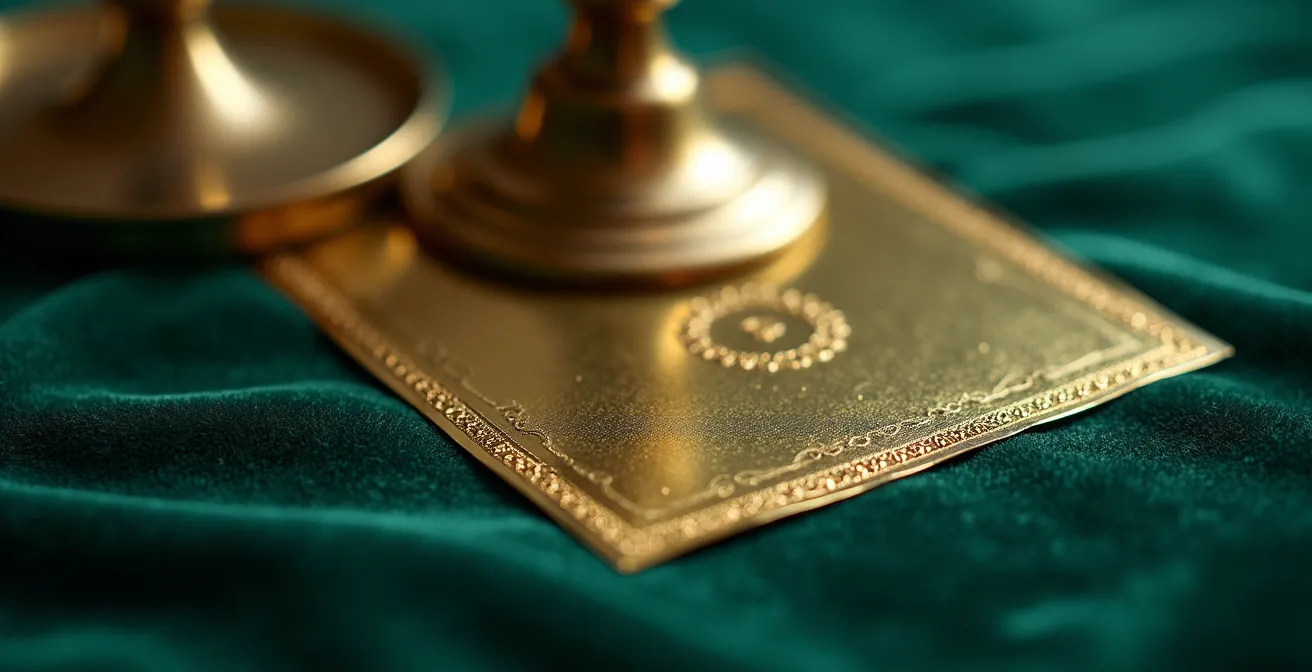
The most sophisticated approach is to use both, creating a layered and texturally rich environment. Pair brass candlesticks on your tables with menus featuring delicate gold foil typography. Place a welcome sign with shimmering gold letters next to a table adorned with vintage brass bud vases. This intentional combination of the crisp and the aged, the light and the substantial, is what elevates the design from a simple theme to a curated experience. It shows a deep understanding of materials and a commitment to detail.
This comparative table, drawing on insights from professional event designers, breaks down the decision-making process. According to an analysis of vintage wedding decor, matching the material to its function is critical.
| Aspect | Gold Foil | Brass |
|---|---|---|
| Best For | Flat items (invitations, menus) | 3D objects (candlesticks, frames) |
| Finish | Crisp, modern luxury | Aged patina for authenticity |
| Cost Impact | Higher printing costs | Variable based on vintage sourcing |
| Visual Weight | Light and ethereal | Substantial and grounding |
Ultimately, the choice is not an “either/or” but a “where and why.” Use foil for its modern brilliance and brass for its historical soul.
Thrifting vs. Renting: where to find 150 vintage goblets efficiently?
The dream of a tablescape adorned with 150 unique, mismatched vintage goblets is a powerful one. It promises character, color, and a story in every glass. This leads to a major logistical crossroads: do you embark on a months-long treasure hunt through thrift stores, or do you opt for the one-click convenience of a rental company? The answer isn’t just about cost; it’s about valuing your time, energy, and sanity during the wedding planning process.
Thrifting offers the allure of discovery and the potential for a truly unique collection. However, the “Total Cost of Ownership” extends far beyond the price tag on each goblet. You must factor in the dozens of hours spent visiting stores, the cost of gas, the immense cleaning effort required, the risk of breakage, and the critical need for storage space. After the wedding, you’re left with the task of reselling or re-homing 150 glasses. For most couples, this romantic idea quickly becomes a stressful part-time job.
Renting, on the other hand, provides efficiency and peace of mind. Rental companies that specialize in vintage tableware offer curated collections of mismatched goblets, ensuring quality, cleanliness, and cohesion. They handle delivery, pickup, and washing. While the per-item cost may seem higher upfront, it often proves more economical once you account for the hidden costs of thrifting. However, a full rental can sometimes lack the personal “found” story.
Case Study: The Hybrid Sourcing Strategy
A bride successfully navigated this dilemma by pioneering a hybrid approach. She rented 100 basic vintage-style glasses from a rental company to form the reliable foundation for her tables. Then, over six months, she enjoyed the “thrill of the hunt” on a smaller, manageable scale, sourcing 50 truly unique and special thrifted pieces from Facebook Marketplace and local estate sales. These hero pieces were mixed in with the rentals. This strategy saved her an estimated 40% compared to a full rental of premium mismatched glassware, all while creating stunning visual interest and satisfying her desire for a personal touch without the overwhelming logistics.
For most couples, the hybrid strategy offers the perfect balance: the efficiency of renting combined with the personal, curated story of thrifting a few special pieces.
Why forcing guests into strict period dress codes often backfires?
The idea of looking out at a sea of guests perfectly clad in 1920s flapper dresses and three-piece suits is a tempting fantasy for anyone planning a vintage wedding. It seems like the ultimate way to achieve full immersion. However, enforcing a strict, costume-like dress code is one of the quickest ways to turn a heartfelt celebration into an uncomfortable performance. It shifts the focus from celebrating your union to scrutinizing outfits, and it can place a significant financial and social burden on your loved ones.
Guests may feel anxious about “getting it right,” stressed about the cost of a single-use outfit, or simply uncomfortable in period-specific clothing. As wedding expert Hannah Nowack, Senior Editor at The Knot, points out, the primary goal should always be the guest experience. In an interview with WeddingPro about evolving trends, she states that the focus must remain on celebration, not performance.
A great wedding makes guests feel comfortable and cherished, not judged on their outfit. The primary goal is celebrating the couple, not creating a performance.
– Hannah Nowack, Senior Editor at The Knot
A far more elegant and inclusive approach is to “invite” participation rather than “mandate” a costume. Instead of a strict dress code, use phrases on your wedding website like, “We’d be delighted if you’d join us in celebrating with a nod to the Roaring Twenties—think elegant cocktail attire with a touch of glamour.” This suggests the mood without creating pressure. The most effective strategy, however, is to provide the vintage touch yourself. A couple planning a 1920s-themed wedding found immense success with an “accessory opt-in.” They provided a beautiful display of pearl strands for the ladies and pocket squares for the gentlemen upon arrival. This simple gesture cost only $3 per guest but resulted in 95% enthusiastic participation, creating a wonderful sense of visual cohesion and fun without burdening anyone.
Remember, the goal is for your guests to feel like honored participants in your joy, not extras in a period drama. A light touch is always more sophisticated.
Font choices: how to hint at a classic era on invites without looking dated?
The invitation is the first tangible piece of your wedding that guests will experience. It sets the tone, manages expectations, and offers a glimpse into the style of the day. For a vintage-inspired wedding, font choice is a delicate balancing act. Leaning too heavily on overly ornate, era-specific fonts is the fastest way to make your stationery look like a prop from a high school play. A truly modern and elegant approach relies on the principle of strategic font pairing, not singular font selection.
The secret is to use a decorative, “vintage” font with extreme restraint. Use it only for key moments of high impact, such as the couple’s names or the main headline. This is your aesthetic anchor. For all other information—the date, time, location, and details—you must pair it with a clean, classic, and highly legible font. This could be a simple, modern sans-serif like Helvetica or a timeless serif font. This pairing creates a “visual bridge” between the past and the present. The decorative font provides the soul and character, while the clean font ensures readability and a contemporary feel.
Ignoring this balance is a common mistake. An invitation set entirely in a complex, swirling Victorian script is not only difficult to read but also feels overwhelmingly archaic. It screams “theme” rather than “style.” The contrast between an ornate script and a minimalist block text is what creates visual sophistication. It shows that you understand the history but are not bound by it. This intentional anachronism—the deliberate mix of styles—is the hallmark of a well-curated design. It tells your guests they are invited to an elegant affair with a nod to the past, not a historical reenactment.
The following table outlines effective pairing strategies for different vintage eras, demonstrating how to balance decorative flair with modern clarity.
| Era | Decorative Font (Headlines) | Clean Font (Body) | Modern Touch |
|---|---|---|---|
| 1920s Art Deco | Geometric sans-serif | Simple serif | Foil accents only |
| Victorian | Ornate script (names only) | Modern sans-serif | Minimal embellishments |
| Mid-Century | Retro script | Clean Helvetica | Bold color blocking |
Your invitation should be a whisper of the era to come, not a shout. Let the pairing of fonts do the talking, hinting at history while being firmly planted in modern design.
Grandmother’s china vs. Rental charger plates: mixing old and new
One of the most personal ways to incorporate a vintage feel is by using family heirlooms, and grandmother’s china set is often the star candidate. The emotional resonance is powerful, but the practical challenges can be immense: you may not have enough pieces for all your guests, the patterns might clash, and the risk of breaking irreplaceable items is high. Forcing a full set of mismatched, delicate china onto every place setting can create visual chaos and logistical stress. The key is not to force the heirloom into a functional role it can’t handle, but to elevate it into an “heirloom hero moment.”
This strategy involves showcasing the heirloom in a limited, high-impact way that tells its story without compromising the overall tablescape. Instead of using the china for the main course, reserve it for a single, special moment in the evening. This preserves the items and makes their appearance far more memorable. A perfect example of this is using the heirloom plates exclusively for the cake-cutting ceremony, a method that has been used to create a deeply emotional highlight during the reception.
Case Study: The Heirloom Hero Moment Strategy
A couple beautifully integrated their grandmother’s 1952 china collection by reserving it for the cake service. Each guest received their slice on an heirloom plate, accompanied by a small, elegant provenance card that explained the china’s 70-year family history. This transformed a simple dessert into a poignant storytelling moment, connecting guests to the family’s legacy. For the main meal, they used modern rental plates on top of simple, elegant charger plates, ensuring a cohesive and practical dining experience.
When you are mixing the old with the new on your tables, creating a “visual bridge” is essential for a cohesive look. This means consciously selecting modern elements that echo the vintage pieces. If you’re using heirloom china, pull a minor color from its pattern and use that for your linen napkins or rental charger plates. This creates a subtle link that makes the combination feel intentional, not random. The goal is harmony, not just juxtaposition.
- Choose rental chargers in a solid color that is pulled directly from the vintage china’s pattern.
- Select modern chargers made of glass or matte ceramic to provide a neutral base that complements, rather than competes with, the china.
- Layer the setting with linen napkins that echo one of the primary or secondary colors of the vintage pattern.
- Balance the ornate plates by pairing them with sleek, modern stemware.
- Use contemporary flatware (in gold, matte black, or silver) to prevent the overall look from becoming overwhelmingly vintage.
By giving your heirloom a starring role rather than a supporting one, you honor its history while maintaining a sophisticated, modern aesthetic for your celebration.
How to mix cut crystal with sleek modern stems for a curated look?
The sparkling allure of vintage cut crystal is undeniable. It adds texture, reflects light beautifully, and brings an instant sense of occasion to any tablescape. However, a table set entirely with ornate, heavy crystal can feel dated and visually busy. The modern approach to achieving a curated, collected-over-time look is to thoughtfully mix your elaborate crystal pieces with simple, sleek, modern glassware. This contrast is the secret to making the vintage pieces feel special and intentional, rather than just old.
The most effective strategy is to assign roles to your glassware based on function. Use the more decorative and often more robust cut crystal glasses for water. These will typically remain on the table for the entire evening, acting as a constant, shimmering decorative element at each place setting. For wine service, opt for minimalist, modern stems. Their clean lines and lack of ornamentation are not only practical for frequent handling and refilling by staff but also allow the color and clarity of the wine to be the focus. This functional pairing feels logical and looks effortlessly chic.
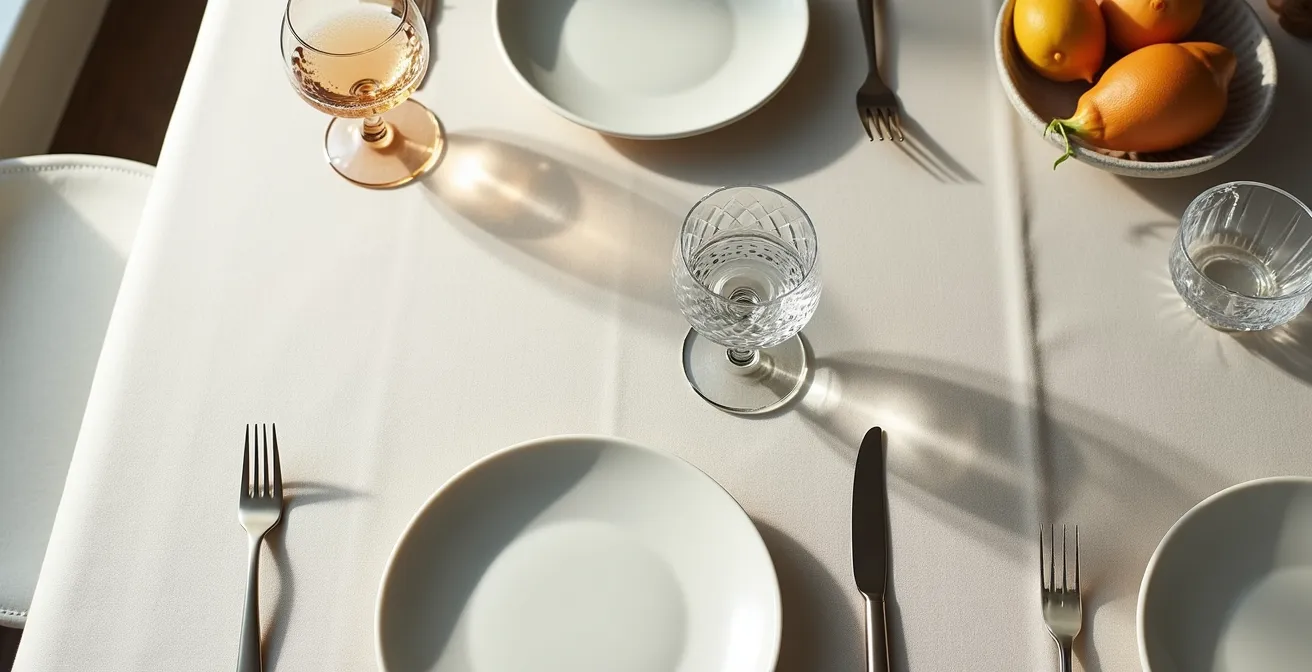
Another key element in this mix is varying the height and silhouette of the glassware. The combination of a lower, wider cut crystal goblet with a tall, slender modern wine glass creates a dynamic and visually interesting skyline at each setting. It breaks up the monotony and adds a layer of design sophistication. This is the difference between simply putting glasses on a table and truly designing a tablescape. It’s a deliberate choice that shows you’ve considered every detail.
This guide helps to clarify the roles each type of glass can play, ensuring both beauty and practicality.
| Glass Type | Assigned Function | Visual Impact | Practical Reason |
|---|---|---|---|
| Cut Crystal | Water glasses | Decorative constant | Remain on table all night |
| Modern Stems | Wine service | Sleek functionality | Frequently handled and refilled |
| Height Variation | Both types | Dynamic silhouette | Creates visual interest |
This intentional anachronism—placing the old and new side-by-side in purposeful roles—is what defines a modern, stylish take on vintage decor.
Key Takeaways
- Curate, Don’t Accumulate: Focus on creating high-impact “heirloom moments” with a few meaningful vintage items rather than cluttering your space with thematic props.
- Prioritize with the 80/20 Rule: Dedicate 80% of your budget and focus on modern comfort and function (especially seating) and use the remaining 20% for decorative vintage aesthetics.
- Build “Visual Bridges”: When mixing old and new, use shared colors, materials, or textures to create a harmonious and intentional connection between the pieces.
How to Use Rattan Furniture for a Modern Look That Isn’t Dated?
Rattan furniture, with its natural texture and woven artistry, can bring a wonderful sense of relaxed elegance to a wedding. However, it walks a fine line between timeless bohemian chic and a dated 1970s throwback. The key to ensuring a modern look is all in the context: what you pair it with, the colors you choose, and the shapes you select. As interior designer and antiques expert Debbie Mathews notes, the appeal of natural materials is their timeless quality, but their application determines their style. She says, ” we have seen a huge movement towards the use of natural materials as they not only lend a textured, organic look to a space, but they also have a timeless and casual aesthetic.”
To keep rattan feeling fresh and contemporary, you must deliberately break its historical associations. Step away from the classic 70s palette of mustard, brown, and avocado. Instead, pair rattan with a crisp, modern color scheme like black and white or deep jewel tones such as emerald or sapphire. This immediately elevates it. Placing a rattan peacock chair in a formal, unexpected venue, like an industrial loft or a historic ballroom, creates a powerful stylistic contrast that feels edgy and modern.
The silhouette of the furniture also matters. Opt for rattan pieces with clean, geometric lines over the overly curvy, elaborate designs of the past. Finally, think of rattan as a textural accent, not the main event. Use it for a statement lounge area, a few select chairs, or bar shelving, but don’t furnish the entire event with it. Mixing it with other materials, especially luxe fabrics like velvet cushions or sleek metallic accents like brass or gold, adds a layer of sophistication that firmly plants the look in the present day.
- Pair rattan furniture with a modern palette of black and white or rich jewel tones, avoiding dated 70s earth tones.
- Choose pieces with clean, geometric lines instead of the traditional curvy peacock chair silhouette for a more contemporary feel.
- Create stylistic contrast by placing rattan furniture in unexpected, formal venues.
- Mix rattan with polished metallic accents, such as brass or gold, to create an elevated, sophisticated look.
- Use rattan as a strategic accent piece (e.g., a lounge area, a bar front) rather than the dominant furniture style.
- Combine rattan with luxe fabrics like velvet or linen for cushions and pillows to add softness and sophistication.
By thoughtfully considering color, context, and combination, rattan becomes a powerful tool for adding warm, organic texture to a modern and stylish wedding.