True visual cohesion in wedding design comes from strategic subtraction, not overwhelming addition.
- Master the 60-30-10 color rule to establish a balanced, non-fatiguing visual foundation.
- Use consistent lighting and repeating textural elements to unify disparate spaces and furniture.
Recommendation: Use a tightly curated mood board not as a scrapbook for ideas, but as a disciplined filter to say “no” to anything that dilutes your core vision.
For design-conscious couples, the fear is palpable: a wedding that looks like a chaotic collage of disconnected Pinterest boards. You collect beautiful ideas—a floral arrangement here, a tablescape there—but worry they will clash, creating a visually messy and disjointed experience for your guests. The common advice to “pick a theme” or “choose your colors” often falls short, leading to an accumulation of items rather than a curated atmosphere. This approach can quickly overwhelm a venue, making it feel cluttered instead of chic.
The core problem isn’t a lack of ideas, but a lack of an editing framework. What if the secret to a stunningly cohesive wedding wasn’t about adding more, but about the art of intentional subtraction? This guide reframes wedding design from the perspective of an art director, focusing on principles of visual hierarchy, negative space, and disciplined curation. It’s about creating a single, powerful composition where every element has a purpose and the space itself can breathe.
We will explore how to build this visual harmony, starting with the mathematical precision of color balance and moving through the transformative power of lighting. We’ll discuss how to maintain aesthetic consistency across different event spaces and, most importantly, which elements to cut to amplify your overall impact. Finally, we’ll delve into using your mood board as a strategic tool and weaving your personal story into the design with subtlety and grace.
This article provides a structured path to achieving a sophisticated and unified aesthetic. The following summary outlines the key principles we will cover, each designed to empower you to make confident, intentional design decisions for a beautifully cohesive celebration.
Summary: A Guide to Creating a Cohesive Wedding Environment
- Why sticking to the “60-30-10” color rule prevents visual chaos?
- How to use uplighting to merge mismatched furniture into a unified look?
- Indoor to Outdoor: keeping the aesthetic consistent when moving guests
- The 3 decor items you should cut to improve the overall visual impact
- From sunset to midnight: adapting the environment for the party phase
- How to use your moodboard to say “no” to mismatched decor ideas?
- The 60-30-10 rule: preventing eye fatigue with proper color ratios
- How to Weave Your Love Story into Custom Styling Without Looking Tacky?
Why sticking to the “60-30-10” color rule prevents visual chaos?
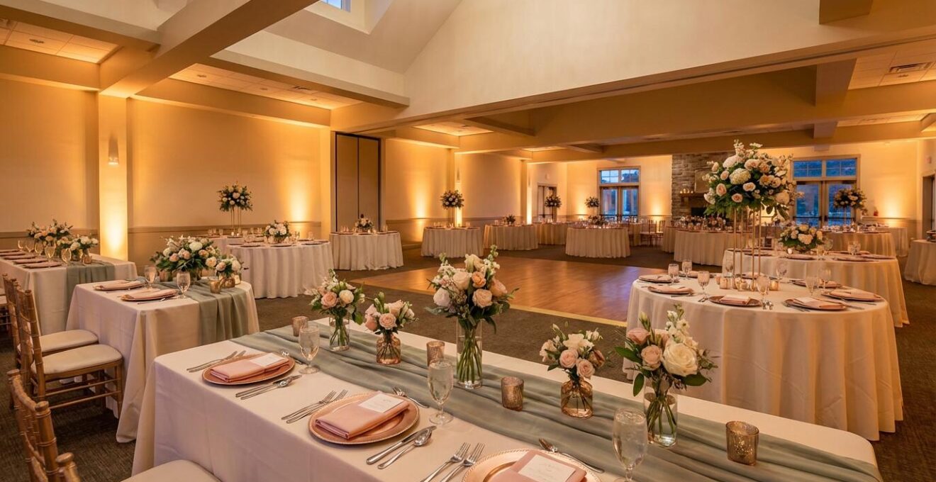
The single greatest tool against visual chaos is not a theme, but a mathematical formula: the 60-30-10 rule. This classic interior design principle is the bedrock of a balanced and sophisticated environment. It dictates that 60% of your space should be a dominant color, 30% a secondary color, and 10% an accent color. This ratio creates a clear visual hierarchy, allowing the eye to move comfortably through the space without feeling overwhelmed by competing hues. It provides structure and prevents the “everything-is-important” look that leads to a cluttered feel.
In a wedding context, your dominant 60% is established by the largest visual surfaces: linens, draping, and perhaps even the primary color of the venue’s walls. The secondary 30% adds interest and depth, often carried through bridesmaid dresses, floral arrangements, and stationery. The final 10% is the spark—the metallic finish on cutlery, the color of a single-stem bud vase, or the ribbon on a favor. This is where you add personality without disrupting the harmony.
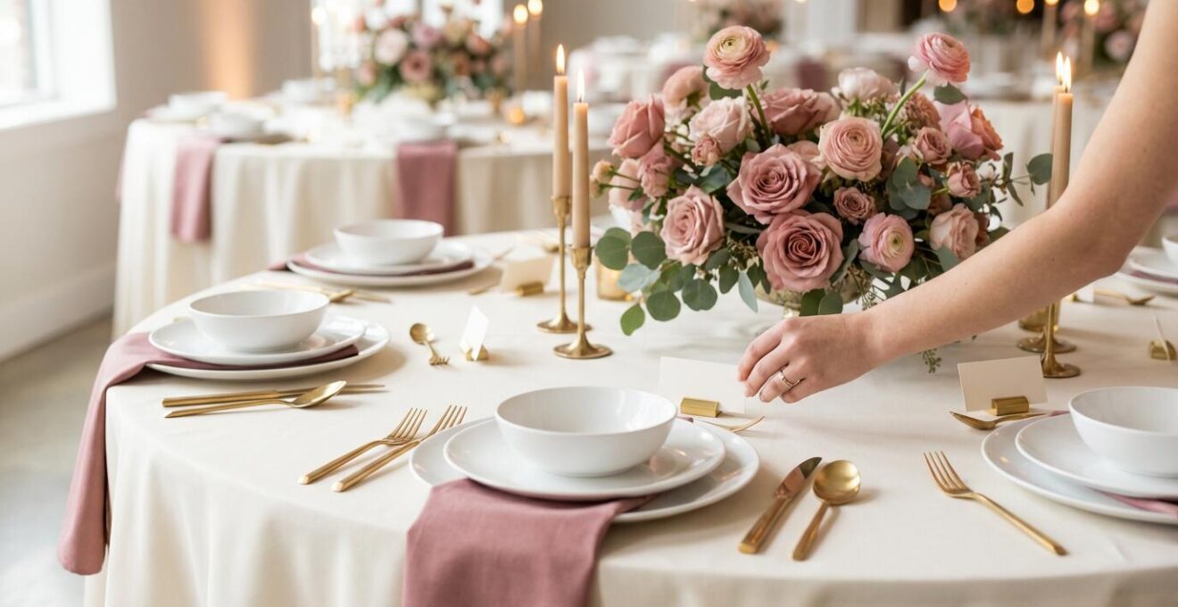
As the image above illustrates, this rule isn’t restrictive; it’s liberating. By making a conscious decision about your color proportions, you create a built-in filter for every other choice. When selecting your palette, start with the foundational 60%—perhaps your linen or key floral colors—and the rest of the puzzle naturally falls into place. This disciplined approach ensures that your venue feels intentionally designed, not accidentally decorated.
How to use uplighting to merge mismatched furniture into a unified look?
Even the most beautiful venue can present challenges, such as mismatched furniture or architectural styles that don’t quite align with your vision. Instead of trying to hide or replace these elements, a far more effective strategy is to unify them with light. Uplighting, in particular, is a powerful tool for creating cohesion. As wedding planners explain, uplighting creates ambiance and depth by projecting beams of light upwards from fixtures placed on the floor, creating “pillars” of color that wash over walls and objects.
This technique works by drawing the eye upward and away from the floor-level details you wish to de-emphasize. By bathing different chairs, tables, and architectural features in the same consistent color, you effectively “paint” them into a single, unified scene. The individual differences in furniture style or finish become secondary to the cohesive wash of light. This creates a powerful mood and a sense of intentionality, making the entire space feel like a single, curated environment.
The key is strategic placement and color choice. Position lights at the base of architectural elements like columns or along bare walls to create texture and drama. The colors you choose should complement your 60-30-10 palette. Soft, warm ambers and pinks can foster a romantic and intimate atmosphere, while bolder jewel tones can signal a transition to a high-energy party. For a more natural look, mixing in warm white lights can highlight textures on stone or wood without appearing artificial. This is sensory consistency in action—using light to tell the same story your colors and textures are telling.
Indoor to Outdoor: keeping the aesthetic consistent when moving guests
One of the biggest challenges to cohesion is a multi-space event, such as moving guests from an outdoor ceremony to an indoor reception. The shift in environment can feel jarring if not managed with care. The secret to a seamless transition is to create a consistent aesthetic thread that guides guests from one space to the next. This isn’t about making the two spaces identical, but about echoing key design elements to reinforce a single, unified story.
This can be achieved by repeating specific materials, colors, or motifs. For example, if your ceremony features a dramatic arch with cascading greenery, carry that same type of foliage into the reception space as garlands on tables or as a statement installation above the dance floor. If you’ve chosen a specific monogram or font for your stationery, ensure it appears on signage in both locations. This repetition provides a subtle but powerful sense of continuity, making the entire event feel polished and thoughtfully planned.
Lighting is another crucial tool for bridging indoor and outdoor spaces, but it requires different technical considerations. The fundamental goal remains the same—to establish a consistent mood—but the hardware changes based on the environment.
| Indoor Events | Outdoor Events |
|---|---|
| Can use any style of uplighting to change room color | Require waterproof uplighting fixtures |
| Easy access to wall power outlets | Need wireless, battery-powered uplights due to lack of outlets |
| Lights can be non-battery powered | Can set up lighting anywhere without cord concerns |
By understanding these differences and planning accordingly, you can use light to paint both your indoor and outdoor areas with the same emotional brush, ensuring your aesthetic feels whole and unbroken, regardless of where your guests are.
The 3 decor items you should cut to improve the overall visual impact
The philosophy of a minimalist art director is rooted in a simple truth: addition by subtraction. The most impactful designs are often the result of a rigorous editing process. In wedding decor, the urge to include every beautiful idea is a common pitfall that leads to visual noise. True impact comes from giving your most important details room to breathe. As wedding designers Sarah Fry and Erin Soldezzo note, “Restraint creates clarity. Choose details that best serve your vision and allow them to shine.” This process of intentional editing is where a good design becomes great.
So, what should you cut? While every wedding is unique, there are three common categories of decor that often subtract more than they add:
- Excessive Signage: Do you really need a sign for the guest book, the gift table, and the dessert bar, all with different fonts? Consolidate information where possible and trust your guests’ intuition. A single, beautifully designed welcome or seating chart sign makes a stronger statement than ten small, cluttered ones.
- Unintegrated Favors: Wedding favors placed at every setting can disrupt the clean lines of your tablescape, especially if they don’t align with your color palette or style. Consider offering them from a single, styled table near the exit. This creates a dedicated moment of appreciation without compromising your table design.
- Theme-for-Theme’s-Sake Details: If your theme is “rustic,” you don’t need burlap on everything. If it’s “travel,” you don’t need globes on every surface. Over-literal interpretations of a theme often look tacky. Choose one or two high-impact elements that evoke the feeling of your theme and let them be the heroes.
Think of your decor as a pyramid. The base is your foundation (lighting, linens). The middle is your key thematic pieces (florals, centerpiece). The top is a tiny accent. Cutting items that don’t fit into this hierarchy strengthens the entire structure. To apply this principle effectively, a formal audit is invaluable.
Your Action Plan: Auditing Your Decor for Visual Cohesion
- Visual Touchpoints: List every single location where guests will see a decor element—from the save-the-date and invitation suite to the ceremony aisle, cocktail tables, bar front, and reception tables.
- Decor Inventory: Gather images of ALL potential decor items you are considering. Place them on a single digital board and be brutally honest.
- Cohesion Check: Hold each item against your three “defining words” (e.g., “Organic, Modern, Intimate”). If an item doesn’t align with all three words, it’s a candidate for elimination.
- Impact vs. Noise Analysis: For each item, ask: “Does this create a high-impact moment, or is it just filling space?” Categorize them into ‘Essential Foundation,’ ‘Key Statement,’ and ‘Small Accent.’ Anything else is noise.
- Integration Plan: Create your final, edited list of decor. For every “no,” there is no replacement; you are creating valuable negative space. For every “yes,” assign it a specific, purposeful place from your touchpoints list.
From sunset to midnight: adapting the environment for the party phase
A wedding is not a static event; it’s a narrative with evolving chapters. The romantic, serene atmosphere appropriate for dinner is not the high-energy vibe you want for the dance party. A truly cohesive design anticipates and facilitates these shifts. The most powerful tool for this transformation is, once again, lighting. Dynamic lighting allows you to completely alter the mood of a room without changing a single physical object.
Professional lighting designers achieve this by programming different “scenes” that can be triggered at key moments. For example, the lighting can be set to a warm, soft, and static glow at 50% brightness during dinner, creating an intimate and conversation-friendly environment. Then, with the flip of a switch for the first dance or the opening of the dance floor, the scene can change dramatically to introduce moving beams, vibrant colors, and subtle strobing effects. This instantly signals a shift in energy, inviting guests to move from dining to celebrating.
The key to a smooth transition is creating master scenes that adjust all fixtures simultaneously. This ensures a holistic change rather than a disjointed effect of controlling lights one by one. As lighting professionals confirm, this type of event illumination can fundamentally change the tone of a room. This pre-programmed evolution makes the lighting feel like a natural part of the event’s flow, supporting the emotional arc of the evening from heartfelt speeches to uninhibited dancing. It’s the ultimate expression of an environment that is not just decorated, but alive and responsive.
How to use your moodboard to say “no” to mismatched decor ideas?
A mood board is often treated as a scrapbook—a place to collect anything and everything you like. This is precisely why so many wedding designs end up feeling disconnected. From an art director’s standpoint, a mood board is not a collection tool; it is a filtering tool. Its primary function is to serve as your visual anchor, a definitive guide that helps you (and your vendors) say “no” with confidence.
The process starts with emotion, not objects. As experts Sarah Fry and Erin Soldezzo advise, “Start by deciding, as a couple, what feeling you want guests to walk away with.” Once you have that emotional anchor—be it “joyful and vibrant,” “intimate and romantic,” or “modern and chic”—every choice can be measured against it. Your mood board should be a visual translation of that feeling, not just a catalog of pretty things. Curate it ruthlessly. Instead of dozens of photos, select a small, intentional collection that speaks to a specific color tone, texture, or mood.
To make it a truly effective decision-making tool, your mood board should be comprehensive. It must include not just flowers and dresses, but also fonts, lighting styles, textures (velvet, linen, acrylic), and even a “no board”—a small section showing styles that are explicitly off-brand. When a new idea or suggestion arises, hold it up to the board. Does it fit seamlessly, or does it clash? If it clashes, the answer is no, regardless of how beautiful the item is in isolation. Sharing this tightly curated board with all your vendors ensures everyone is designing from the same disciplined vision, preventing mismatched suggestions and guaranteeing a cohesive final look.
Key Takeaways
- A disciplined color palette, governed by the 60-30-10 rule, is your strongest defense against visual chaos.
- Lighting is not an afterthought; it is a primary design tool that unifies spaces, masks imperfections, and dictates the emotional arc of the event.
- True cohesion is achieved by repeating key elements—colors, textures, and motifs—subtly and consistently across different zones and moments of your wedding.
The 60-30-10 rule: preventing eye fatigue with proper color ratios
We’ve established the 60-30-10 rule as a tool for visual hierarchy, but its importance goes deeper: it’s about managing sensory input for your guests. A space with too many competing, equally-weighted colors is visually exhausting. The eye doesn’t know where to rest, leading to a subtle feeling of chaos and overstimulation. The 60-30-10 rule is designed specifically to prevent this eye fatigue by creating a clear and pleasing color journey.
The science behind this is simple. As design experts have established, when 60 percent of a room is in your primary color, it creates a dominant, restful backdrop. This main color anchors the space and gives the eye a “home base.” The 30% secondary color provides visual interest and guides the eye through the room, while the 10% accent color delivers small, delightful pops of energy. This measured proportion ensures that colors are noticeable without being overpowering.
Applying this rule allows you to be bold with your color choices without risking a chaotic outcome. Whether you prefer a dramatic, complementary scheme or a soft, analogous one, the ratio is what holds it all together. It is the invisible structure that makes a design feel both exciting and harmonious.
This principle can be applied to various color theories to achieve different moods, all while maintaining balance. Understanding these options gives you a framework for building a sophisticated palette.
| Color Scheme Type | Description | Wedding Example |
|---|---|---|
| Complementary | Colors directly opposite on the color wheel | Navy blue (60%) with warm oranges (30%) in florals/accents (10%) |
| Analogous | Colors that sit next to each other on the wheel | Soft green (60%) with sage and mint (30%) and pale blue (10%) |
| Monochromatic | Varying shades, tints, or tones of a single color | Multiple shades of pink creating a sleek, cohesive, sophisticated look |
How to Weave Your Love Story into Custom Styling Without Looking Tacky?
Personalization is the soul of a wedding, but it’s also where many designs veer into tackiness. The key to weaving your love story into your styling with elegance is subtlety. It’s about translating your story into sensory elements rather than literal labels. As wedding planner Skylar Caitlin puts it, cohesion “isn’t about pounding guests over the head with an idea, but rather gently weaving aligned items together.” The goal is a unified design that guests feel, even if they can’t pinpoint exactly why it works so well.
Instead of naming tables after places you’ve traveled, consider using the color palette of your favorite destination as the 30% or 10% in your 60-30-10 rule. Instead of a cake topper shaped like your pet, incorporate a subtle floral element that nods to the dogwood trees where you had your first picnic. This is about evoking a feeling, not creating a literal reenactment. One of the most effective methods for this is through consistent graphic design. Using a single designer to create a custom monogram or select a signature font suite ensures that this element appears seamlessly from invitations to day-of signage, creating a powerful and polished personal brand for your event.
This approach treats your personal details as subtle “Easter eggs” for guests to discover, making the experience more intimate and engaging. Limit your narrative to two or three core stories and find subtle ways to repeat them. Perhaps the texture of your invitations mimics the linen of a favorite dress, or a signature cocktail is a refined version of the drink you had on your first date. This is intentional storytelling, and it elevates personalization from a simple statement to an integrated, artful expression of who you are as a couple.
To put these principles into practice, begin not by looking for things to buy, but by defining the core feeling you want your wedding to evoke. That emotional clarity will be your most valuable guide in creating a space that is not only beautiful but also deeply and cohesively yours.