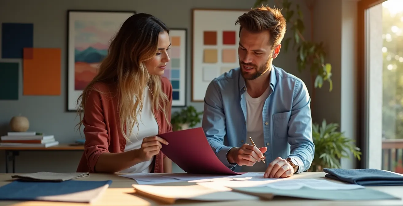
The emotional atmosphere of your wedding is not a matter of chance; it’s a variable you can control by treating color as a behavioral tool, not just a decorative element.
- Specific colors trigger predictable neuro-biological responses that can increase appetite, alter the perception of time, or induce anxiety.
- A structured color ratio (the 60-30-10 rule) is essential for preventing visual overstimulation and creating a psychologically comfortable environment for guests.
Recommendation: Shift your focus from “what colors look pretty?” to “what behavior do I want to encourage in this space?” and build your palette to achieve that specific outcome.
Every couple wants their wedding to have a specific “vibe”—be it romantic, energetic, elegant, or relaxed. Most turn to Pinterest boards and trending palettes, hoping the right combination of hues will magically create this feeling. They meticulously select bridesmaid dresses and floral arrangements based on aesthetics, believing that a visually pleasing event is an emotionally resonant one. This approach, however, leaves the most critical factor to chance: the actual psychological and behavioral response of your guests.
The common advice to simply “choose colors that reflect your personality” is a platitude that ignores the powerful, subconscious influence of your environment. But what if the key to curating your wedding’s mood wasn’t in the colors themselves, but in how you strategically deploy them? What if you could use color to make conversations flow more easily in the lounge, encourage guests to hit the dance floor, or even make the food taste more satisfying? This is not a matter of taste, but of science.
This guide moves beyond simple aesthetics to give you a behavioral color theorist’s perspective. We will deconstruct the neuro-biological impact of color choices, revealing how they can be used to engineer a specific guest experience. You will learn not just *what* colors to use, but *why* they work and *how* to combine them to create a cohesive emotional journey for everyone present. By the end, you will have the tools to design an event that doesn’t just look beautiful, but feels exactly the way you’ve always imagined.
text
This article will guide you through the scientific principles of using color to influence mood and behavior in specific wedding contexts. The following summary outlines the key areas we will explore to help you build a psychologically effective color strategy.
Summary: A Strategic Guide to Wedding Color Psychology
- Why adding red accents to the dining room might increase food consumption?
- Does a blue room make the night feel longer or calmer?
- Why overuse of bright yellow can make guests feel subconsciously anxious?
- White vs. Red: navigating color meanings in multicultural weddings
- The 60-30-10 rule: preventing eye fatigue with proper color ratios
- Why sticking to the “60-30-10” color rule prevents visual chaos?
- Pastels vs. Jewel Tones: choosing colors that ground the whimsy
- How to Execute a Monochromatic Palette That Has Depth and Interest?
Why Adding Red Accents to the Dining Room Might Increase Food Consumption?
The link between the color red and appetite is one of the most well-documented principles in behavioral psychology, famously exploited by the fast-food industry. This is not a cultural association but a physiological one. Exposure to the red wavelength can increase heart rate and metabolism, creating a physical state of heightened arousal that our brain can interpret as hunger or excitement. Using red accents in a dining space is a direct way to tap into this primal response.
However, the goal at a wedding is not to encourage the hurried consumption seen at a fast-food chain. The strategy is to create an environment of convivial energy. This is achieved through what we call sensory synergy. When red accents on napkins or in floral centerpieces are combined with warm, low lighting and the rich aromas of the food, the effect is magnified. The color primes the body, and the other senses confirm the brain’s interpretation: this is a warm, inviting place to enjoy a hearty meal.
A sophisticated approach is to use ‘color pulsing.’ Instead of overwhelming the space with permanent red walls, you introduce the color on transient items. Think red water goblets, appetizer plates, or even the color of a signature cocktail served upon entry to the dining hall. This provides the initial physiological stimulus to kickstart appetite without causing prolonged agitation, ensuring the dining experience remains elegant and comfortable, not frantic.
Ultimately, a few well-placed red elements can do more to enhance the perception and enjoyment of the meal than any other single decorative choice.
Does a Blue Room Make the Night Feel Longer or Calmer?
A room bathed in deep blue tones can profoundly influence guests’ state of mind, affecting everything from their mood to their perception of time. The key lies in the concept of temporal perception. Cool, low-arousal colors like navy or indigo blue have been shown to slow our internal clock. In this calmer state, time feels as if it’s passing more slowly, creating an ideal atmosphere for a lounge area where the goal is to encourage long, deep conversations and relaxed mingling.
It’s crucial, however, to understand the paradox of blue. The hue itself is calming, but its effect is moderated by light. A deep, dimly lit navy blue room promotes introspection and calm. In contrast, a bright, saturated electric blue light, often used on dance floors, has the opposite effect. This high-intensity blue light is known to suppress melatonin production, boosting energy and alertness, making guests want to dance all night. The same color, applied differently, yields opposite behavioral outcomes.
This distinction allows for a powerful strategy of ‘behavioral zoning.’ You can design distinct emotional experiences within the same venue. Use dynamic, bright blue lighting to make the dance floor feel energetic and make the party seem endless. Simultaneously, create a ‘chill-out zone’ nearby with plush seating, soft fabrics, and deep, low blue ambient light. This gives guests a dedicated space to retreat, recharge, and connect on a more intimate level, making the event feel both exciting and restorative.
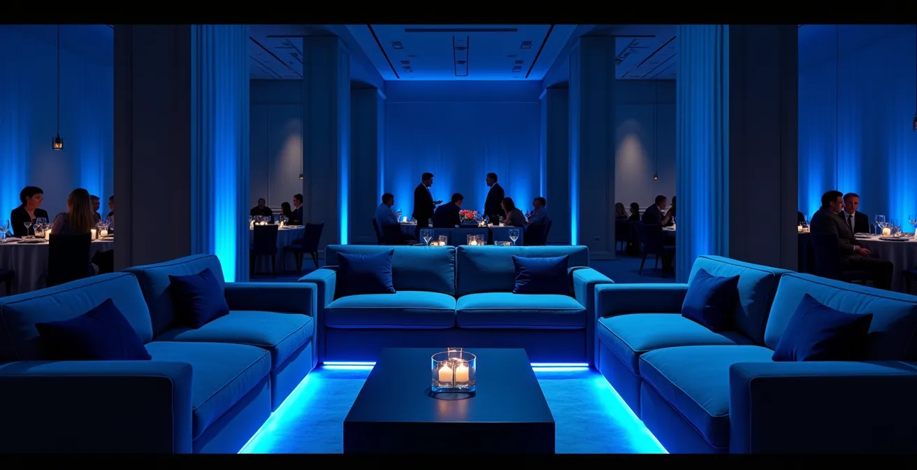
As the image suggests, a thoughtfully designed blue space becomes an oasis of calm. The layering of different blue-toned textures—from velvet to linen—and the use of soft, focused lighting create a sanctuary that encourages guests to settle in and truly connect.
By understanding this, you move from simply decorating a room to architecting an experience, ensuring every corner of your venue serves a distinct psychological purpose.
Why Overuse of Bright Yellow Can Make Guests Feel Subconsciously Anxious?
While yellow is often associated with happiness and optimism, its application in an event space is a neuro-behavioral balancing act. A touch of yellow can be beneficial; some studies show that the brain secretes more serotonin when exposed to yellow, which is why a few yellow flowers on a table can make guests feel cheerful. However, an overuse of bright, saturated yellow can quickly backfire, inducing a state of subconscious anxiety and irritation.
The primary reason for this is physiological. Of all the colors in the spectrum, bright yellow is the most fatiguing to the human eye due to the high amount of light it reflects. This intense stimulation of the retina can lead to a phenomenon known as ‘chromatic fatigue.’ The brain and eyes are working overtime to process the overwhelming visual information, which can manifest as a low-level, yet persistent, feeling of agitation or anxiety in guests, even if they can’t pinpoint why they feel unsettled.
Furthermore, the psychological impact of yellow is highly dependent on its surrounding colors. When paired with black, for example, it mimics a biological warning signal (seen in bees and hazard signs), triggering an instinctual state of alertness. A better strategy is to use yellow as a carefully placed ‘punctuation mark’ to draw attention to a key focal point, such as the cake table or a signature cocktail bar. For a warmer, more inviting feel without the risk of overstimulation, consider more sophisticated, muted shades like ochre, mustard, or marigold.
By using yellow strategically and sparingly, you harness its positive, mood-lifting qualities while avoiding the unintended consequence of creating a visually stressful environment.
White vs. Red: Navigating Color Meanings in Multicultural Weddings
Color symbolism is one of the most significant challenges in a multicultural wedding. White, representing purity and new beginnings in many Western cultures, is traditionally associated with mourning in some Eastern cultures. Conversely, red, a color of luck, joy, and prosperity in Chinese, Indian, and Vietnamese traditions, can carry connotations of anger or warning in the West. Navigating this is not about choosing one culture over the other, but about creating a new, shared narrative.
The most successful approach is a ‘third way’ strategy of thoughtful integration. This moves beyond simply having a ‘white section’ and a ‘red section.’ Instead, it’s about fusing the elements in a way that feels intentional and unified. Imagine a bride in a classic white gown adorned with intricate red embroidery, or a ceremony space decorated in elegant white that is later transformed for the reception with dramatic red uplighting. These choices don’t create a clash; they symbolize the union of two backgrounds into one new family.
True success requires going beyond stereotypes. It is vital to interview both families to understand their personal and generational associations with color, which can often be more nuanced than broad cultural rules. Proactive communication is also a powerful tool. A small, elegant note in the wedding program or a sign at the entrance explaining the color choices can turn a point of potential confusion into a beautiful, educational story for your guests. For example: “Our palette blends the Western tradition of white for new beginnings with the Eastern symbolism of red for a future filled with joy and prosperity.”
By framing your color palette as a deliberate story of unity, you honor both heritages and create a visually and emotionally cohesive experience for everyone.
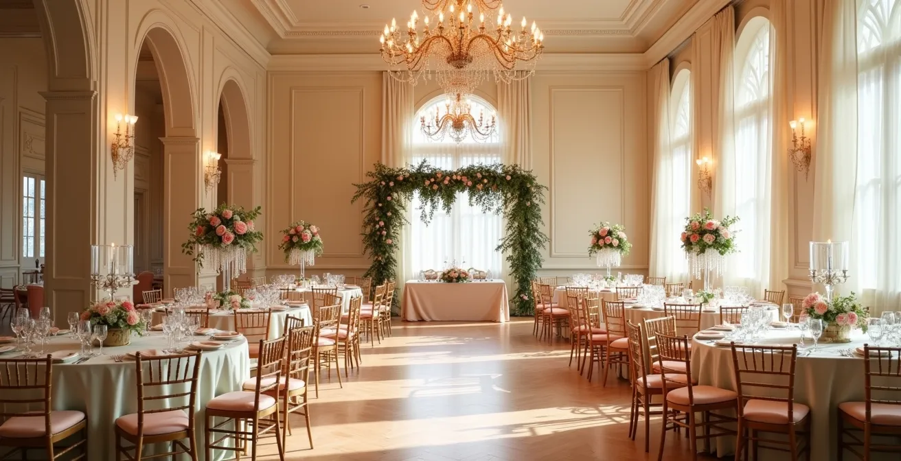
The 60-30-10 Rule: Preventing Eye Fatigue with Proper Color Ratios
The 60-30-10 rule is a timeless principle in interior design, but for a wedding, its function is primarily psychological. It is the single most effective tool for preventing the ‘visual chaos’ that leads to mental and ocular fatigue in guests. The rule dictates that 60% of your space should be a dominant color, 30% a secondary color, and 10% an accent color. This isn’t an arbitrary formula; it’s based on how our brains are wired to process visual information.
Our eyes and brain instinctively seek balance and hierarchy in any environment. The 60% dominant color (often seen on walls, large linens, or major draping) creates a stable, enveloping foundation for the overall mood. The 30% secondary color provides visual interest and contrast without competing for attention. Finally, the 10% accent color acts as a series of focal points, guiding the eye to what is most important, like the centerpieces, bouquets, or small decor details. This guided visual path is less cognitively demanding, allowing guests to feel relaxed and settled rather than overstimulated.
The following table breaks down how to apply this rule in a wedding context to achieve a balanced and harmonious environment.
| Color Role | Percentage | Wedding Application | Visual Impact |
|---|---|---|---|
| Primary/Dominant | 60% | Walls, major draping, tablecloths | Sets overall mood and foundation |
| Secondary | 30% | Bridesmaid dresses, chair covers, major florals | Adds visual interest and depth |
| Accent | 10% | Bouquets, napkins, small decor details | Creates focal points and energy |
By adhering to this ratio, you create a space that feels intentional, sophisticated, and, most importantly, psychologically comfortable for your guests over the course of a long event.
Why Sticking to the “60-30-10” Color Rule Prevents Visual Chaos?
Visual chaos is not just about clashing colors; it’s a neurological state caused by a lack of informational hierarchy. When a space is filled with too many competing colors in equal measure, the brain doesn’t know where to look or what to focus on. It’s like trying to listen to five songs at once. This lack of a clear focal point creates a low-level cognitive stress, preventing guests from ever feeling truly at ease. The 60-30-10 rule is the antidote to this chaos.
According to some research, color accounts for 62-90% of a person’s first impression of an environment. A balanced palette instantly communicates harmony and intention. The 60-30-10 rule provides the necessary structure for this positive impression. As design experts note, this formula works because “it allows the eye to move comfortably around a space.” The dominant color provides the background, the secondary color adds interest, and the accent color directs attention. This creates a logical visual path for the brain to follow, which is inherently calming.
This rule also serves the event’s narrative. The 60% dominant color is the ‘setting’ of your story (e.g., an ethereal, light-filled garden). The 30% secondary color is a key ‘character’ (e.g., a deep, passionate love represented by burgundy). The 10% accent is the series of ‘plot points’ or moments of joy (e.g., glimmers of gold). Without this clear structure, the story becomes muddled, and the intended emotional impact is lost in the visual noise.
Sticking to this ratio is less a rule of design and more a rule of brain-friendly communication, ensuring your aesthetic choices translate into the desired emotional experience.
Pastels vs. Jewel Tones: Choosing Colors That Ground the Whimsy
The choice between a pastel palette and one built on jewel tones is a fundamental decision that defines the emotional ‘weight’ of your wedding. It’s a choice between youthful dreaminess and mature sophistication. Pastels like blush pink and baby blue are tints—colors with a high amount of white mixed in. This gives them a low psychological weight; they feel light, airy, and romantic, evoking a sense of nostalgia and whimsy.
In contrast, jewel tones like emerald green, sapphire blue, and amethyst are highly saturated hues. They are visually ‘heavy’ and stable, conveying luxury, confidence, and drama. The key to a sophisticated palette often lies not in choosing one over the other, but in knowing how to combine them. To ‘ground the whimsy’ of a pastel-dominant wedding, for instance, you can introduce a jewel tone on a foundational element, such as using emerald green tablecloths to anchor an otherwise light and airy floral scheme.
Texture is the ultimate moderator in this equation, as it can alter the perceived weight of any color. A pastel pink rendered in a heavy velvet fabric instantly feels more luxurious and grounded. Conversely, a deep emerald green on a sheer, light-as-air silk organza can feel more ethereal and whimsical. By playing with both color and material, you can fine-tune the mood with incredible precision, creating a space that feels both dreamy and sophisticated, romantic and self-assured.
Action Plan: Balancing Whimsy and Sophistication
- Identify Foundation vs. Accent: Determine which elements will ‘ground’ the space (e.g., linens, draping) and which will add ‘lightness’ (e.g., florals, ribbons). Use jewel tones for grounding and pastels for lightness.
- Select a Dominant Emotion: Decide if the core feeling is ‘dreamy romance’ or ‘opulent drama.’ Let this guide whether pastels or jewel tones take the lead in your 60-30-10 ratio.
- Introduce Contrasting Textures: Intentionally pair light colors with heavy textures (e.g., pastel velvet) or deep colors with light textures (e.g., burgundy silk) to create a complex, layered effect.
- Layer Tonal Shades: Instead of one shade of blue, use a range from pastel baby blue to a deep sapphire. This creates depth and prevents the palette from feeling flat, whether you’re using pastels or jewel tones.
- Test with Lighting: Observe how your chosen colors and fabrics interact under different lighting conditions (daylight vs. evening candlelight) to ensure the mood remains consistent.
This conscious combination of psychological weight and texture allows you to craft a wedding environment that is uniquely yours and emotionally complex.
Key Takeaways
- Color is a behavioral tool; use it to actively engineer your guests’ mood and experience.
- Adhering to the 60-30-10 rule is critical for preventing cognitive overload and creating a visually harmonious space.
- Texture and lighting are as important as hue, as they can completely alter the psychological impact of a color.
How to Execute a Monochromatic Palette That Has Depth and Interest?
A monochromatic palette is the ultimate test of a designer’s understanding of sensory psychology. When you remove color variation, you must rely on other elements to prevent the space from feeling flat, sterile, or one-dimensional. The secret to a successful monochromatic design is to create depth and interest through a masterful manipulation of texture, light, and shadow.
Texture becomes your primary tool. For an ‘all-white’ wedding, for example, you must layer a rich variety of contrasting surfaces. Imagine the rough, organic feel of a linen tablecloth, the cool smoothness of a silk runner, the high gloss of a lacquered charger plate, the matte finish of a ceramic vase, and the airy fluff of pampas grass. Each of these surfaces interacts with light differently—absorbing, reflecting, or scattering it—which creates a complex and engaging visual landscape without adding a single new color. As floral experts suggest, even a simple bouquet must use mixed textures to succeed, combining glossy leaves with matte petals.
In a monochromatic scheme, lighting is not an accessory; it becomes a dynamic part of the palette itself. Amber uplighting can wash over white walls, transforming the entire room into a warm, golden-cream environment. Later in the evening, switching to cool blue light can create a serene, silver-blue mood for dancing. Furthermore, you can use ‘non-materials’ like shadow and transparency. Perforated screens or lace hangings cast intricate patterns, while glass and crystal elements add layers of reflection and refraction, giving the space a sense of dimension and magic.
| Texture Type | Light Interaction | Visual Effect | Best Applications |
|---|---|---|---|
| Glossy/Reflective | Reflects light | Makes colors appear brighter | Satin linens, lacquered surfaces, glass elements |
| Matte/Absorbent | Absorbs light | Creates depth and ‘velvety’ appearance | Velvet draping, suede details, matte ceramics |
| Textured/Rough | Scatters light | Adds visual interest and dimension | Linen fabrics, pampas grass, raw wood |
| Transparent | Refracts light | Creates layers and ethereal quality | Sheer curtains, crystal, acrylic details |
By thinking in terms of texture and light, you can execute a sophisticated monochromatic palette that is anything but boring, creating a space that is rich, immersive, and full of subtle detail.