Colors & Textures
The visual and tactile experience of a wedding creates lasting impressions that photographs alone cannot fully capture. The interplay between color and texture shapes how guests perceive the celebration, influences their emotional responses, and determines whether a space feels cohesive or chaotic. From the moment guests arrive, their eyes interpret color relationships while their subconscious registers the richness of fabrics, the warmth of wood, and the shimmer of metallic accents.
Understanding how to orchestrate these elements requires more than selecting pretty swatches. It demands knowledge of color psychology, fabric behavior, texture interaction, and the delicate balance between visual drama and harmony. This foundation will help you make informed decisions that transform venues into atmospheric experiences, whether you’re planning an intimate garden ceremony or a grand ballroom reception.
Why Color Psychology Matters in Wedding Design
Colors communicate directly with our nervous system, triggering responses we often don’t consciously register. This biological reality makes color selection one of your most powerful tools for shaping the wedding atmosphere and guest experience.
Understanding Emotional Responses to Color
Different hues create measurably different psychological effects. Red, for instance, stimulates appetite and raises energy levels—which explains why it appears so frequently in dining environments. When incorporated thoughtfully into reception tablescapes through flowers, linens, or chargers, red tones can make the meal feel more indulgent and conversations more animated. However, excessive red can create restlessness, so balance becomes essential.
Blue wavelengths affect our perception of time, often making environments feel more spacious and moments seem to stretch. Ceremony spaces with blue elements may help nervous couples feel that their vows aren’t rushing past. Conversely, yellow demands caution—while it brings cheerfulness and optimism in controlled amounts, research indicates that oversaturated yellow environments can increase anxiety levels, particularly in enclosed spaces.
Influencing Guest Mood and Experience
Strategic color placement allows you to guide emotional progression throughout the event. Consider using cooler, calming tones in waiting areas where guests gather before ceremonies, then transitioning to warmer, more energizing palettes for reception spaces where celebration and movement are encouraged. This intentional shift supports the natural flow from contemplative ceremony to festive celebration.
The key lies in understanding your specific goals. A sunset wedding might embrace the natural warm-to-cool color transition as daylight fades, reinforcing it through lighting and floral choices. An elegant evening affair might maintain consistent deep jewel tones to create sophisticated continuity from cocktails through dancing.
Building Effective Color Schemes and Palettes
Random color selection creates visual noise that distracts rather than delights. Structured color systems provide the framework that allows individual elements to shine while contributing to a cohesive whole.
Establishing Color Hierarchy
A clear color hierarchy functions like a musical composition—with primary, secondary, and accent notes that create rhythm rather than discord. Start by selecting a dominant color that will occupy roughly 60% of the visual field. This becomes your foundation, appearing in major elements like bridesmaids’ dresses, primary florals, or extensive drapery.
Your secondary color, occupying about 30% of the space, provides support and contrast. It might appear in groomsmen accessories, table runners, or secondary floral varieties. Finally, accent colors—representing just 10% of the palette—deliver strategic pops that draw the eye to focal points: invitation seals, napkin details, or statement centerpiece elements. This 60-30-10 framework prevents visual chaos while maintaining interest.
Monochromatic and Tonal Approaches
Working within a single color family offers sophistication but requires careful handling to avoid flatness. The secret lies in exploiting shade variations within the same hue—moving from pale blush to mauve to deep plum, for example, creates dimension through tonal progression. Different finishes also prevent monotony: matte table linens paired with glossy ribbons and metallic accents in the same color family add visual texture even when chromatically restrained.
Layer these tonal variations strategically, using darker shades to ground the design (table bases, floor-length linens) and lighter tones to create airiness (overhead installations, tall centerpieces). This vertical gradient naturally guides the eye and creates spatial depth.
Color Blocking and Contrast
Color blocking employs bold, geometric divisions of contrasting hues for dramatic impact—think a ceremony backdrop divided into clean sections of navy and gold, or reception tables alternating between all-white and all-burgundy schemes. This technique works particularly well in modern or minimalist weddings where graphic clarity reinforces the aesthetic.
However, high contrast demands careful balancing. The human eye fatigues when forced to constantly adjust between extreme values. Introduce transitional elements—neutral chargers between vibrant linens and plates, or greenery that bridges the gap between contrasting floral colors. These buffer zones provide visual rest stops that make bold contrasts feel intentional rather than jarring.
Choosing the Right Fabrics and Textiles
Fabric selection influences both visual presentation and physical comfort. The way textiles catch light, drape, and respond to touch contributes significantly to the overall sensory experience.
Comparing Fabric Types
Cheesecloth and chiffon often get confused, but their differences matter significantly in execution. Cheesecloth offers an organic, slightly rumpled texture with visible weave irregularities—perfect for relaxed, bohemian, or rustic settings where imperfection feels authentic. It absorbs dye beautifully, making custom color matching achievable. Chiffon, by contrast, provides refined translucency with consistent drape. Its smooth surface reflects light more uniformly, lending itself to elegant, romantic applications like aisle runners or ceiling installations.
Silk accents introduce fluid luxury through their natural sheen and liquid drape. Silk ribbons around bouquets, silk napkins at place settings, or silk sashes on chairs elevate perceived quality instantly. Velvet creates the opposite effect—absorbing light rather than reflecting it, adding weight and richness. The key with velvet is understanding its visual temperature: while technically appropriate year-round, velvet reads as warm, so incorporating it into summer weddings requires balancing with lighter textures and cooler color choices to prevent the overall look from feeling heavy.
Selecting Fabrics That Invite Touch
Weddings are inherently tactile events—guests interact with chair fabrics, table linens, and napkins throughout the celebration. Prioritizing soft, pleasant-to-touch textiles shows consideration for guest comfort. Linen blends offer breathability and natural texture without feeling rough. Washed cotton provides casual softness. Even small touches, like velvet ribbon on programs or silk tassel details on menus, create positive tactile moments that contribute to overall satisfaction.
Consider also how fabrics behave under venue conditions. Outdoor settings may require heavier textiles that won’t constantly shift in breezes. Tented receptions benefit from light-reflecting fabrics that maximize available illumination. Understanding these practical considerations ensures your textile choices perform as beautifully as they appear.
Mastering Texture Layering for Visual Depth
A single-texture environment appears flat and uninteresting, regardless of color complexity. Texture layering creates visual separation that allows the eye to distinguish between elements and perceive depth, transforming two-dimensional color schemes into three-dimensional experiences.
Think of texture layering as building a landscape rather than painting a wall. Start with your foundation texture—perhaps smooth linen tablecloths. Add dimensional contrast through woven chargers or wooden slices as plate bases. Introduce height variation with textured ceramic vessels or rough-hewn candle holders. Finally, incorporate organic texture through florals, bringing in the irregular, natural patterns that soften geometric elements.
Unexpected texture pairings often create the most memorable moments. Mixing terracotta with velvet, for instance, juxtaposes earthy matte surfaces against luxurious pile, creating tension that feels both rustic and refined. Smooth glass vessels on rough wood tables, delicate lace over substantial burlap, or crystalline elements against organic greenery—these contrasts create visual interest that keeps guests discovering new details throughout the event.
The goal isn’t texture chaos but rather thoughtful variety. Aim for three to five distinct texture types within any given tablescape or design vignette. This provides enough variation for interest without overwhelming the senses or diluting your color story.
Working with Natural and Rustic Materials
Natural materials bring warmth, authenticity, and environmental narrative to wedding design. Their inherent imperfections and organic variation create visual interest that manufactured materials struggle to replicate.
Styling Reclaimed Wood Elements
Reclaimed wood tables serve as substantial focal points that anchor rustic and industrial wedding aesthetics. The weathered patina, nail holes, and grain variations tell stories of previous lives, adding character impossible to achieve with new materials. To prevent these elements from reading as merely rough or unfinished, pair them with refined details: crisp white linens as runners (not full coverage, which hides the wood’s beauty), delicate glassware, and sophisticated floral arrangements.
The contrast between the wood’s substantial, aged quality and lighter, more delicate elements creates balance. Consider the wood tone when selecting other colors—gray-weathered wood pairs beautifully with cool palettes and metallics, while warm honey-toned reclaimed wood harmonizes with terracotta, rust, and gold accents.
Incorporating Terracotta and Earth Tones
Terracotta elements provide earthy, rustic elegance through their warm, matte surfaces and handcrafted irregularities. Terracotta vessels, tiles as table numbers, or pottery as votive holders connect the celebration to artisanal traditions and natural clay origins. These pieces work particularly well in outdoor settings where they visually bridge designed elements and the natural environment.
Pairing terracotta with rust tones creates monochromatic earthiness, while combining it with deep greens or blues provides complementary contrast that feels organic rather than forced. The slightly porous, chalky surface of terracotta absorbs light differently than glazed ceramics, contributing to a softer, more relaxed visual atmosphere appropriate for garden parties, vineyard celebrations, or Mediterranean-inspired events.
Incorporating Metallic and Crystal Elements
Metallic and crystalline accents introduce reflectivity and luxury without requiring extensive budgets. These elements catch and multiply light, adding dimension that feels particularly magical during evening celebrations.
Matching gold tones with other metals requires understanding undertones and finishes. Rose gold plays well with copper and warm brass, creating cohesive warmth. Bright yellow gold demands more careful handling when mixed—it tends to dominate cooler metals like silver or pewter unless proportions strongly favor one metal as primary. The safest approach for mixed metals involves selecting pieces with similar finishes (all brushed, all polished, or all antiqued) to create visual unity despite color differences.
Current colored crystal trends move beyond clear to incorporate blush, champagne, smoke, and even deep jewel tones. These tinted crystals maintain light-catching properties while contributing to color stories. Champagne crystal pairs beautifully with gold and warm palettes. Smoke crystal adds sophistication to gray, navy, or black color schemes. Even small touches—crystal drawer pulls as table number holders, crystal beading on linens, or colored crystal votives—deliver significant visual impact relative to their physical presence.
Balance remains essential with reflective elements. Too many metallics and crystals create visual chaos as light bounces unpredictably. Use these elements as strategic accents that guide the eye to focal points: crystal-beaded chargers at each place setting, metallic vases for statement centerpieces, or gold-rimmed glassware that catches candlelight without overwhelming the table.
Navigating the Balance Between Enchantment and Excess
Perhaps the most challenging aspect of color and texture selection involves understanding the fine line between fairytale and childish. Whimsical, romantic design can feel magical or juvenile depending on execution restraint and sophistication level.
The distinction often lies in complexity and subtlety. Pastels in saturated, primary-toy tones read as childish, while muted, dusty versions of the same hues feel sophisticated. Similarly, individual design elements that might seem juvenile in isolation—like butterfly motifs or rainbow color progressions—can feel elevated when executed with refined materials, careful proportions, and sophisticated surrounding elements.
Ask yourself whether your color and texture choices demonstrate intentionality or whimsy for its own sake. A single statement element—perhaps an unexpected pop of color or a dramatic texture pairing—feels confident and designed. Multiple competing “statement” elements simply feel chaotic. Edit ruthlessly, ensuring each color and texture serves a clear purpose in your overall vision.
This foundation in color psychology, palette construction, textile selection, texture layering, and material styling provides the essential knowledge for creating cohesive, atmospheric wedding designs. As you explore specific techniques and applications, these principles will guide your decisions, helping you move from inspiration to execution with confidence and clarity.
How to Use Silk Accents to Elevate Your Wedding Design Instantly?
In summary: The luxury of silk and velvet is not just in their appearance, but in mastering their specific material behaviors to prevent common issues like water spots and creasing. A steamer is superior to an iron for safely removing…
Read more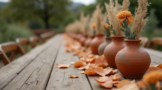
How to Style Terracotta Decor Without It Looking like a Garden Center?
In summary: Elevate terracotta by treating it as a matte canvas for contrasting textures like velvet and linen, a concept we call textural alchemy. Choose a specific color palette—like sage green for organic warmth or dusty blue for Mediterranean romance—to…
Read more
How to Control the Mood of Your Wedding: A Guide to Color Psychology
The emotional atmosphere of your wedding is not a matter of chance; it’s a variable you can control by treating color as a behavioral tool, not just a decorative element. Specific colors trigger predictable neuro-biological responses that can increase appetite,…
Read more
How to Use Velvet Decor in Summer Without It Feeling Heavy or Hot?
Contrary to popular belief, the key to using velvet in summer isn’t to minimize it, but to master its unique physical properties. Velvet’s value lies in its tactile luxury and light-absorbing depth, which can create intimacy even in an airy,…
Read more
How to Execute a Monochromatic Palette That Has Depth and Interest?
The secret to a dynamic monochromatic wedding isn’t the color itself, but how you sculpt light using varied materials and tones. Combining textures like matte, silk, and velvet manipulates light to create natural shadows and highlights. Strategic lighting and subtle…
Read more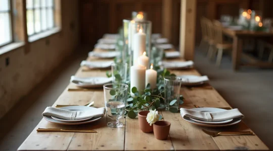
Bare Beauty: How to Style Reclaimed Wood Tables Without Tablecloths
In summary: Focus on strategic “negative space” to highlight the wood’s texture, not just cover it. Prioritize the guest experience by ensuring tables are clean, snag-free, and that place settings are stable. Use runners to create a “spine” for your…
Read more